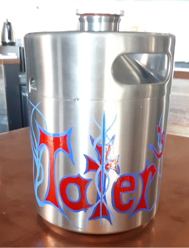
Tater's Custom Pinstriping
Tater's Custom Pinstriping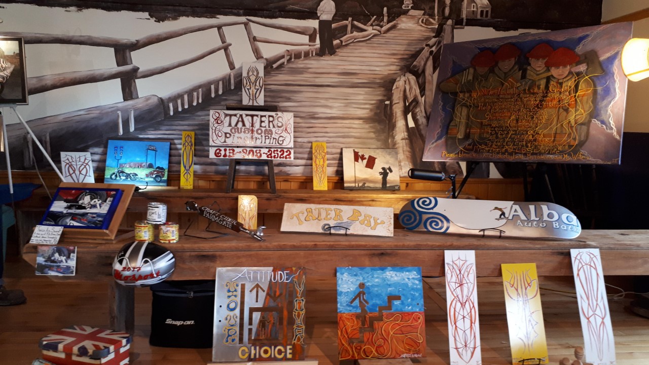
In 2000, during her time living in Edinburgh, Scotland, Lorna was gifted her first set of paints by a dear pal who felt that her pencil sketches could be taken to a whole new level with colour! Moved to action by this generosity, she began to teach herself what is now a passion.
Tater’s Custom Pinstriping intends to blend a passion for all things “motorhead” from traditional pin-striping on bikes or passenger vehicles, to paintings of anything with wheels!
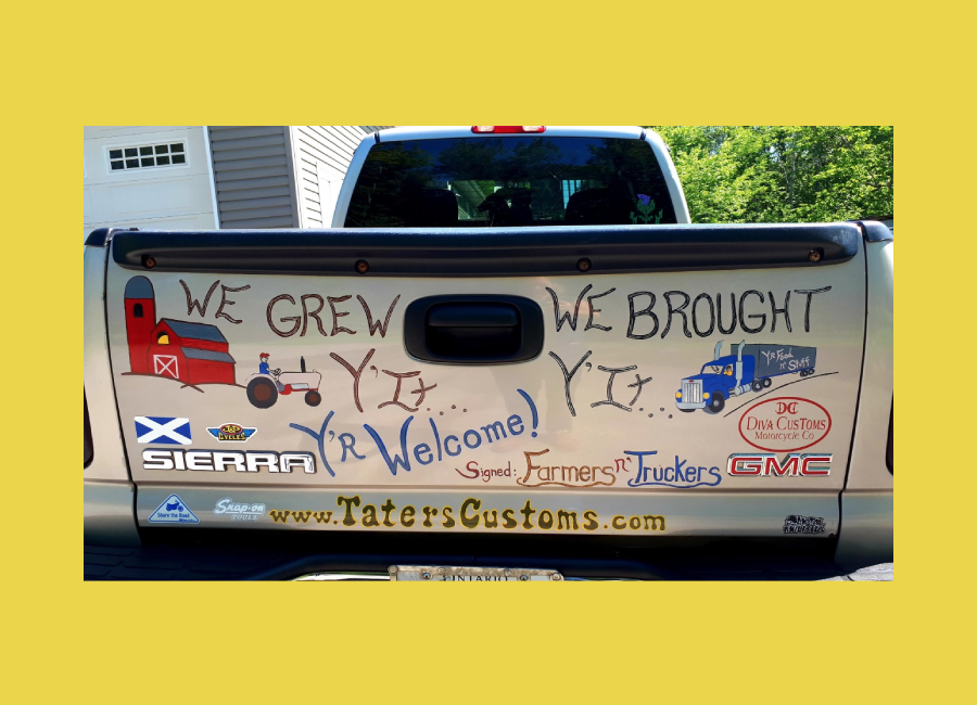
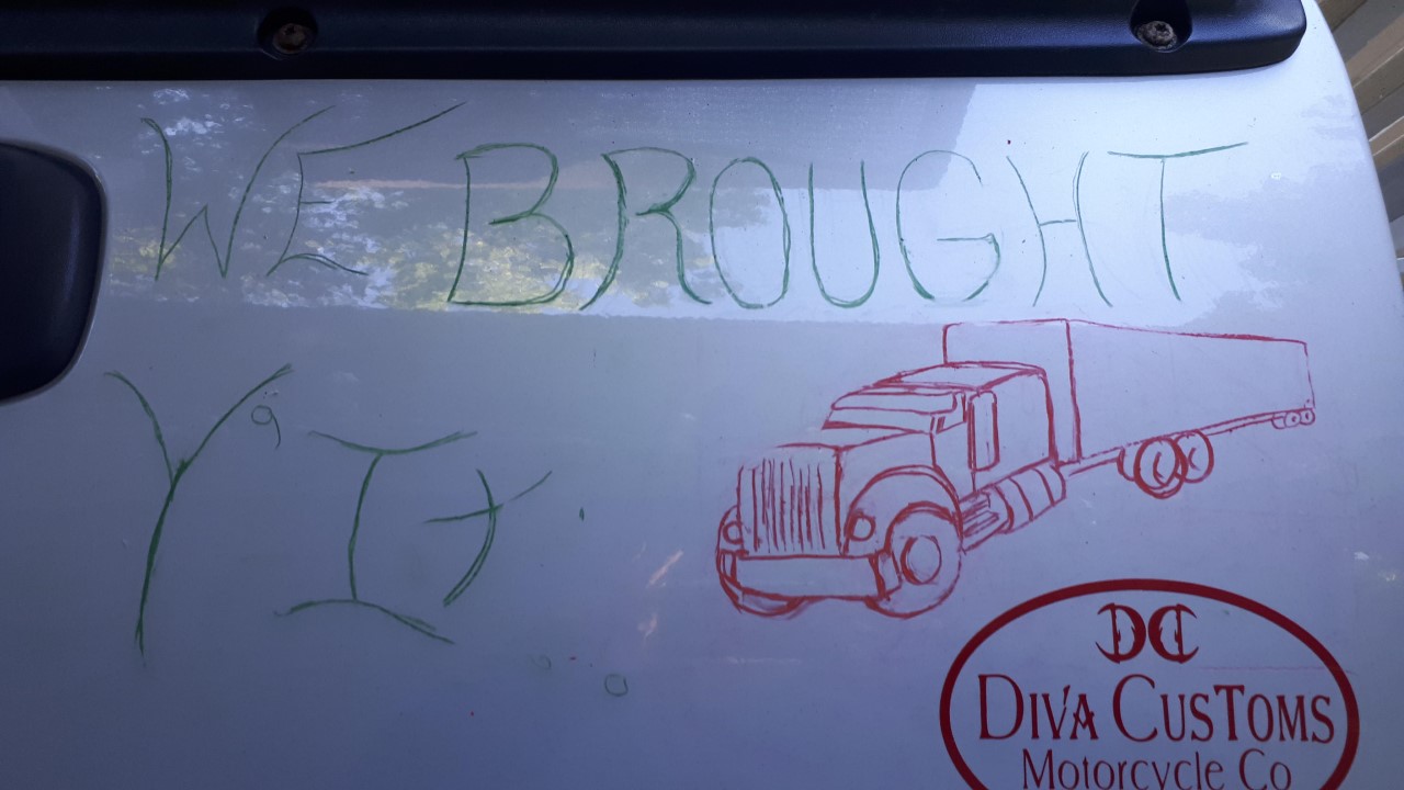
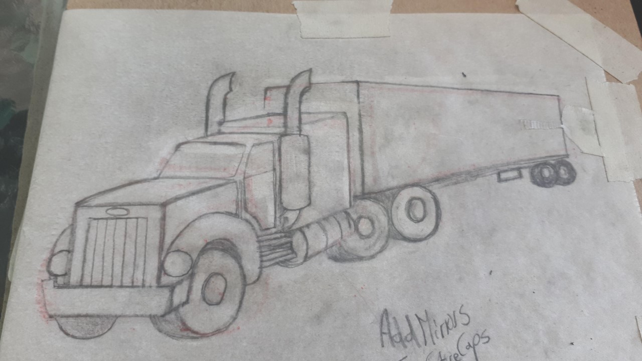
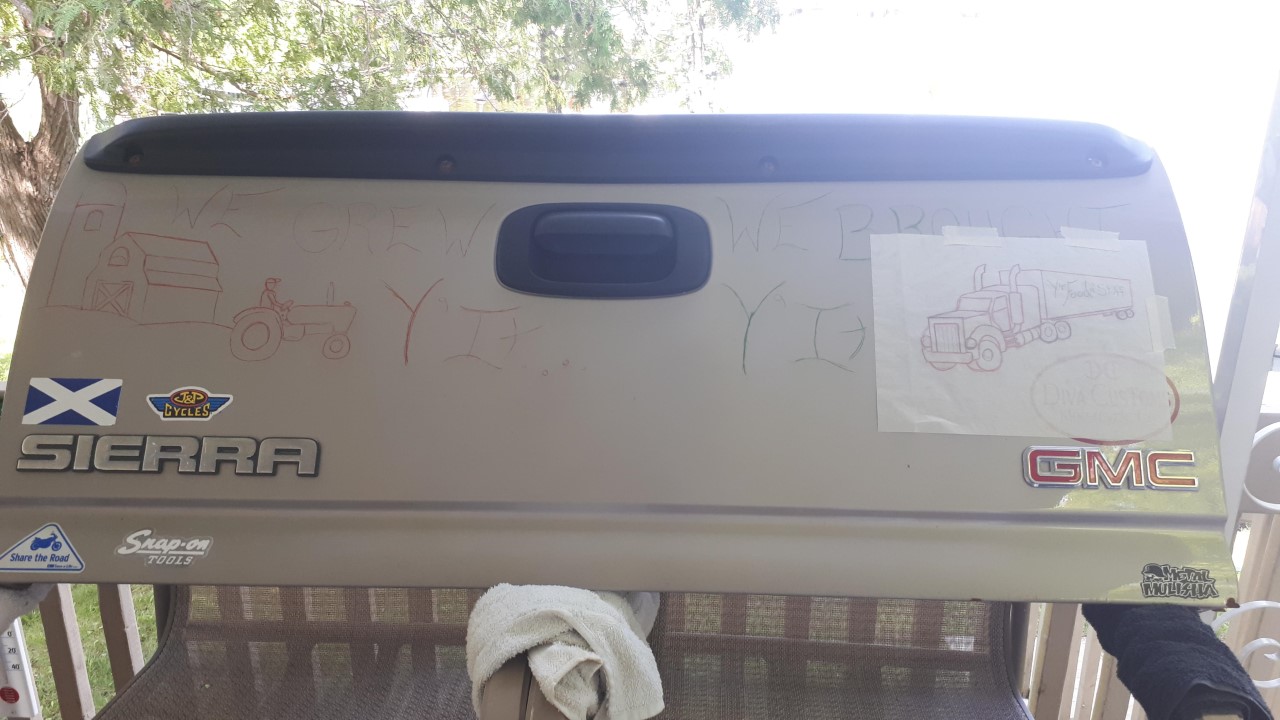
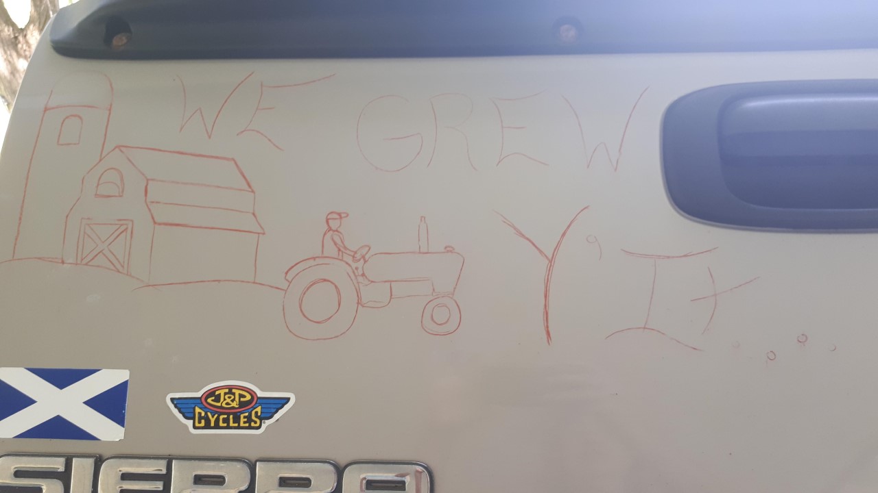
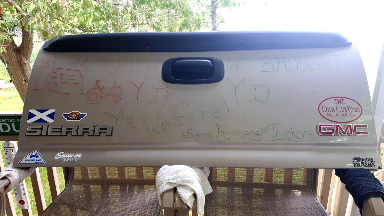
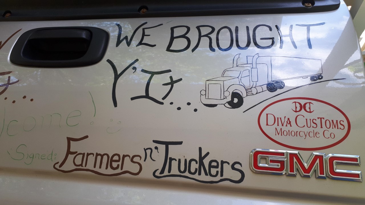
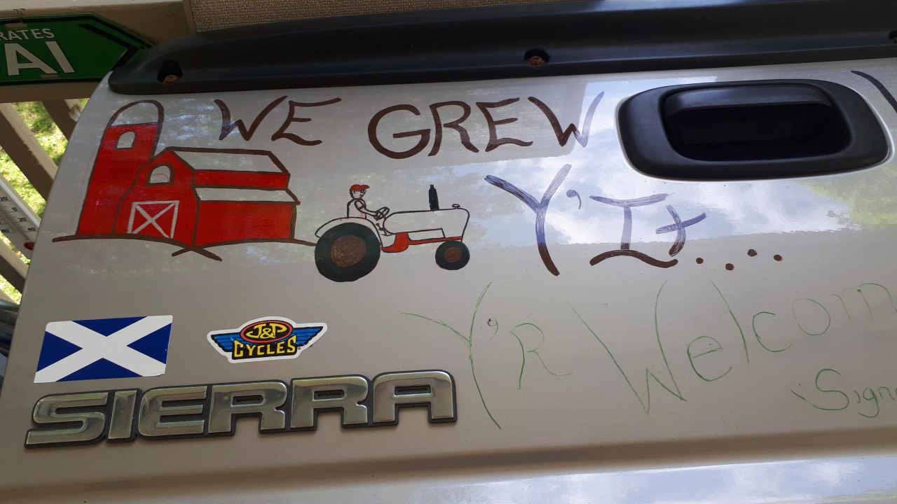
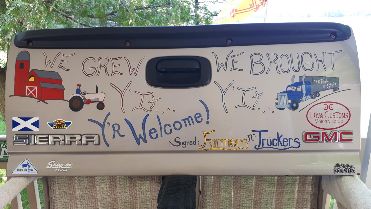
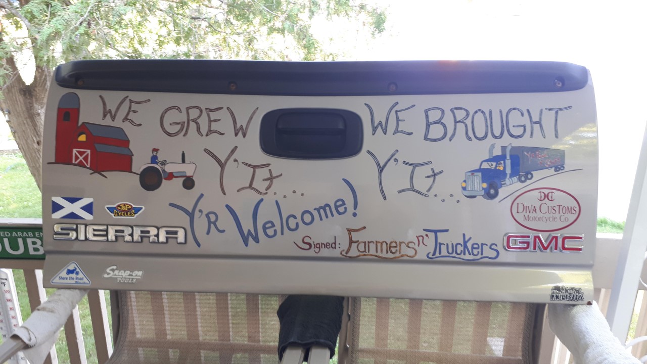
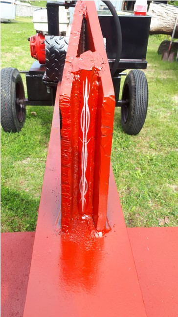
Without these two groups, we would have NOTHING. My ode to farmers n' truckers.
‘Nuff said.
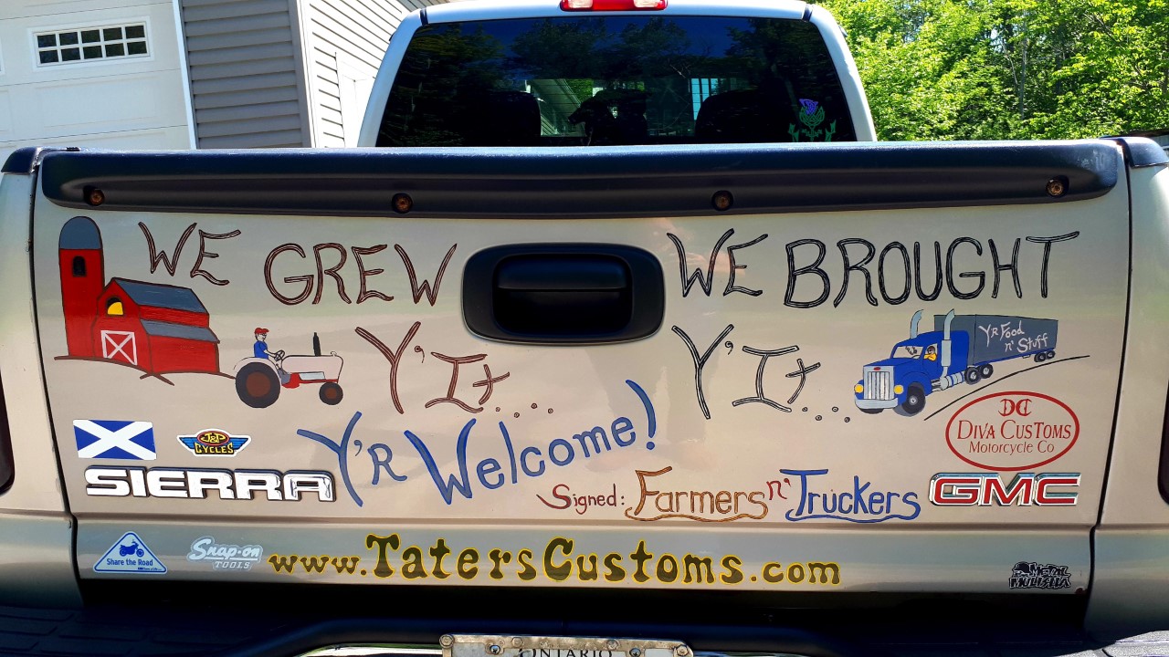
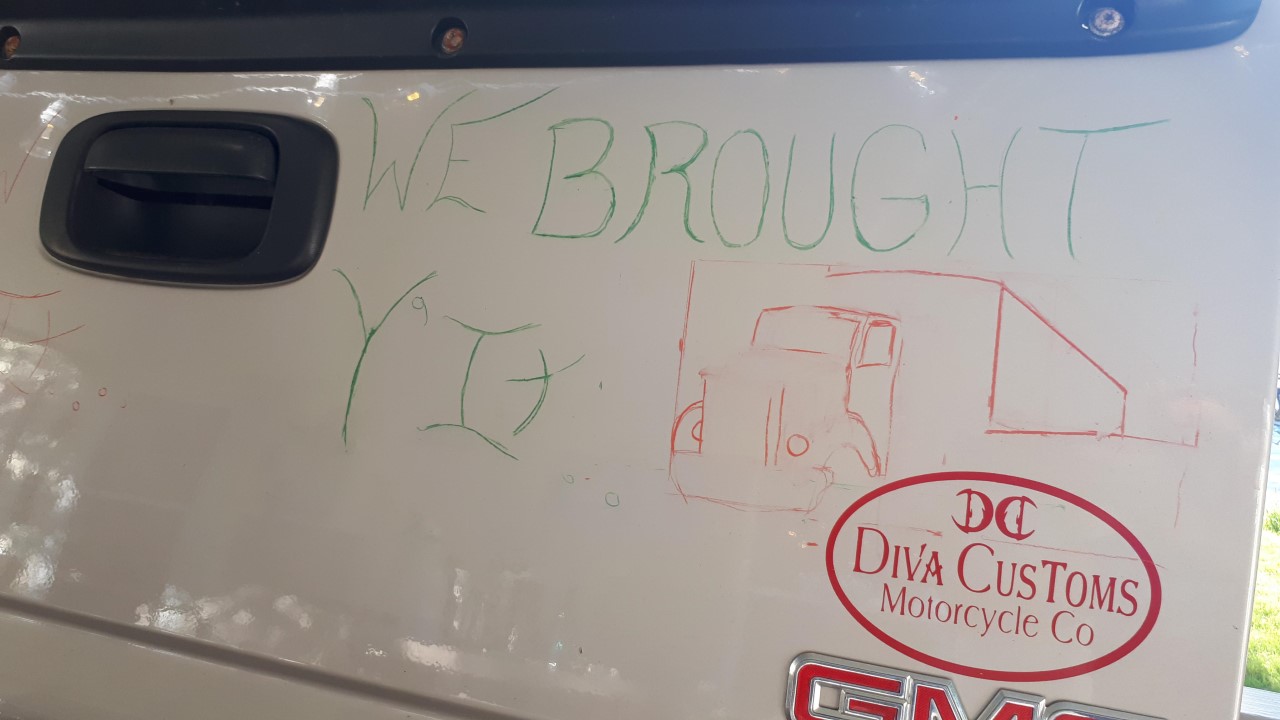
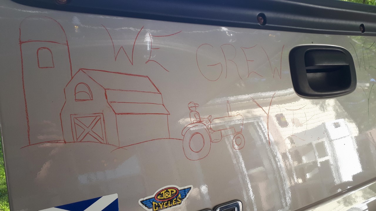
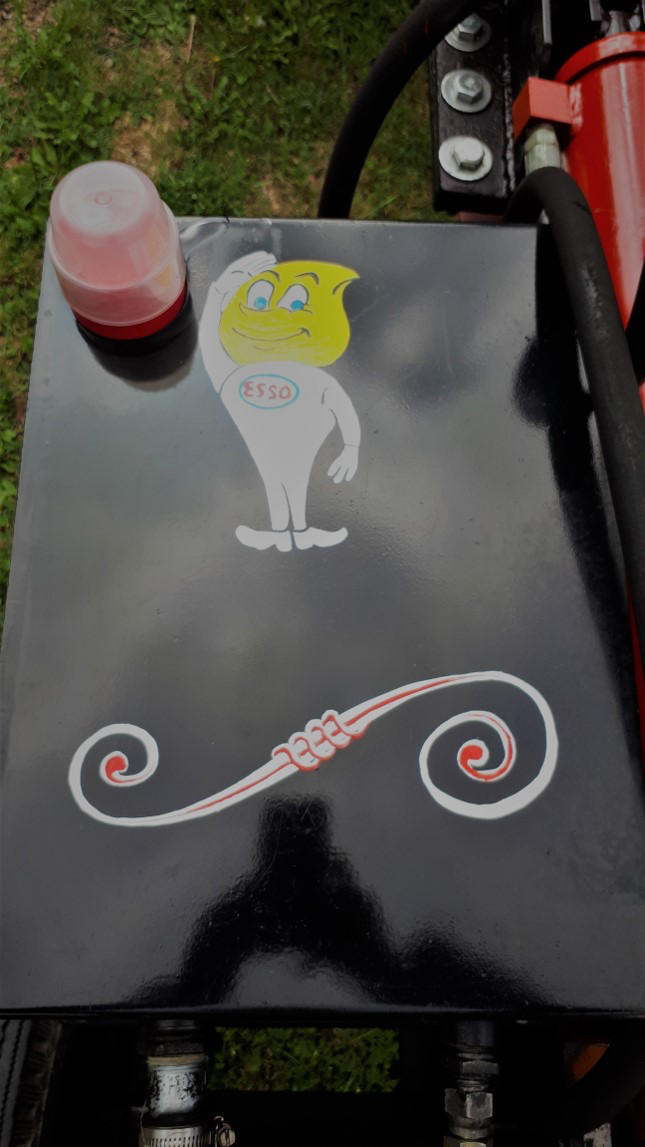
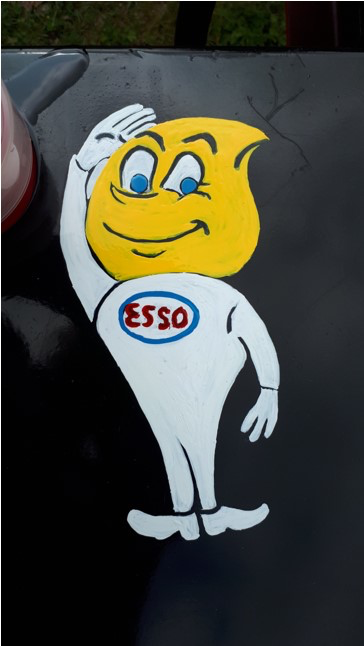
Here, my challenge was laying this playful statement around some beloved decals of places I’d been or support… hey… I’m a KID, too!
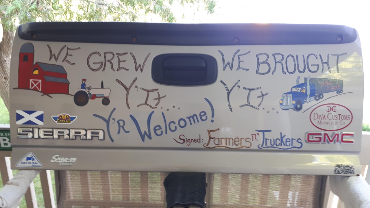
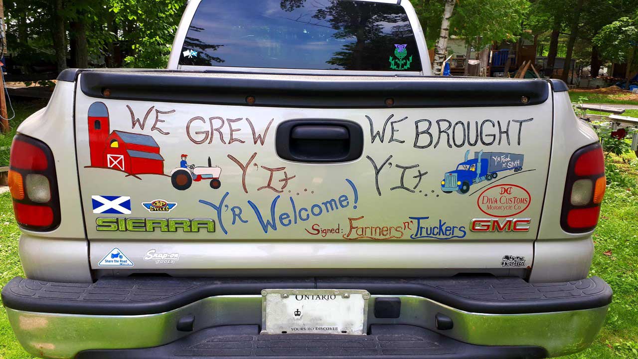
See the transformation below.
This truck had been re-painted and needed it’s stripes laid back on… my early work, but worthy of note…. Chose to repeat the OEM gun metal gray for this hunter’s ride…
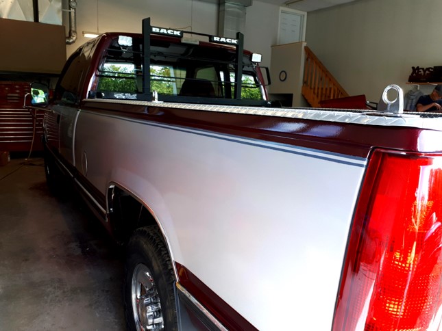
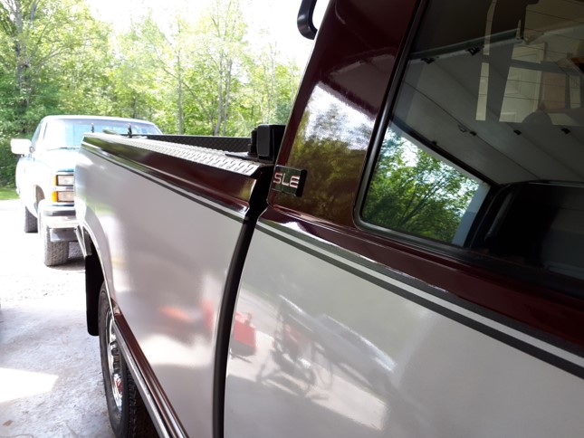
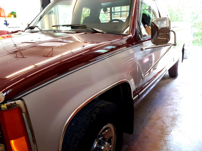
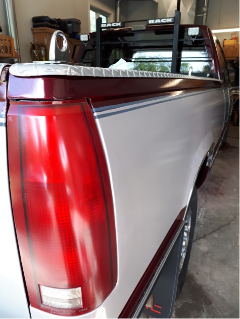
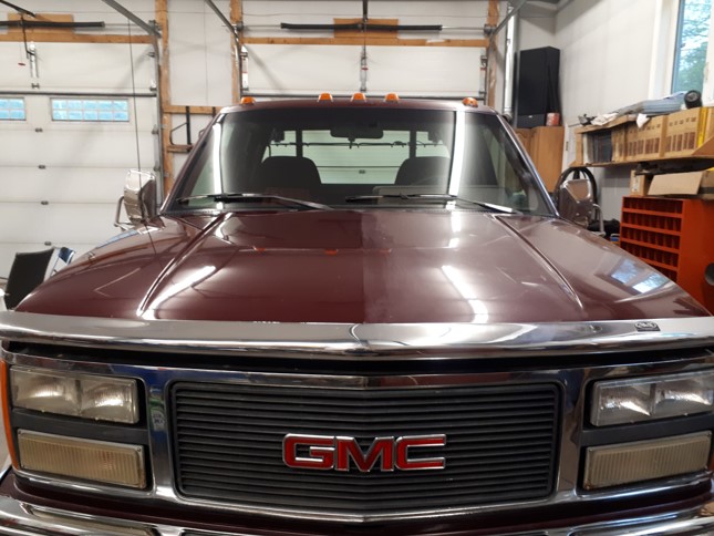
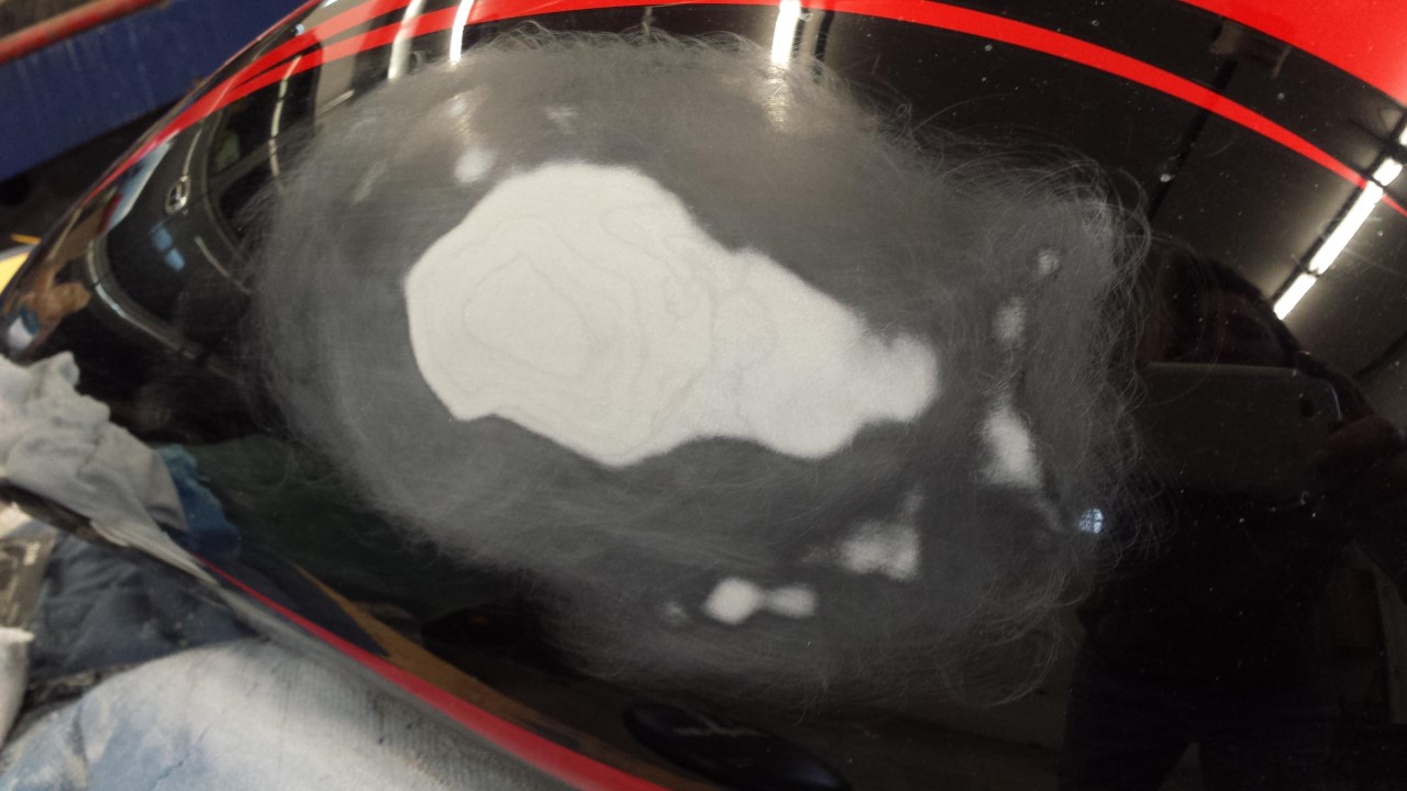
*DETAILER’S DELIGHT! The overspray from the home shop paint job was substantial ~ The retired detailer in me came out to play... that’s NOT wax on the right... it’s the finish pre 3-stage buff right after I clay barred I did it this way for fun because I knew it would look extreme, ha! (later blended across that middle line ~ relax dudes)
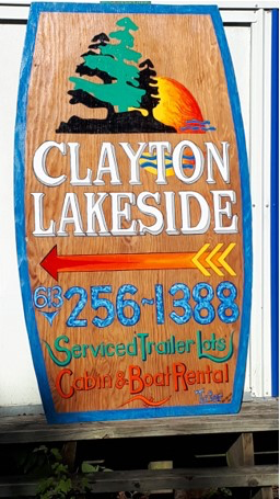
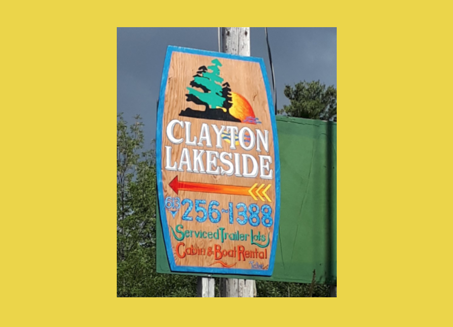
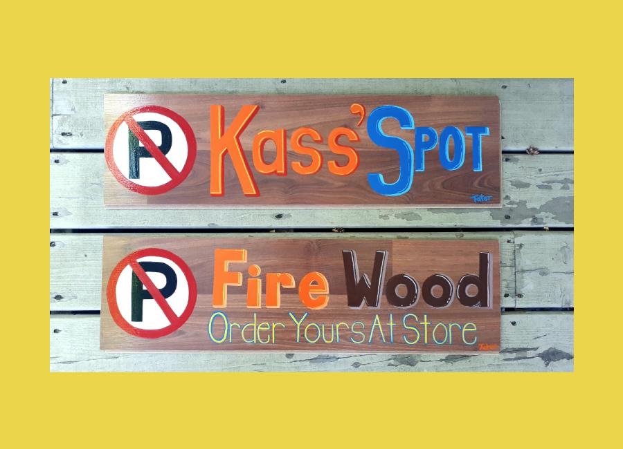
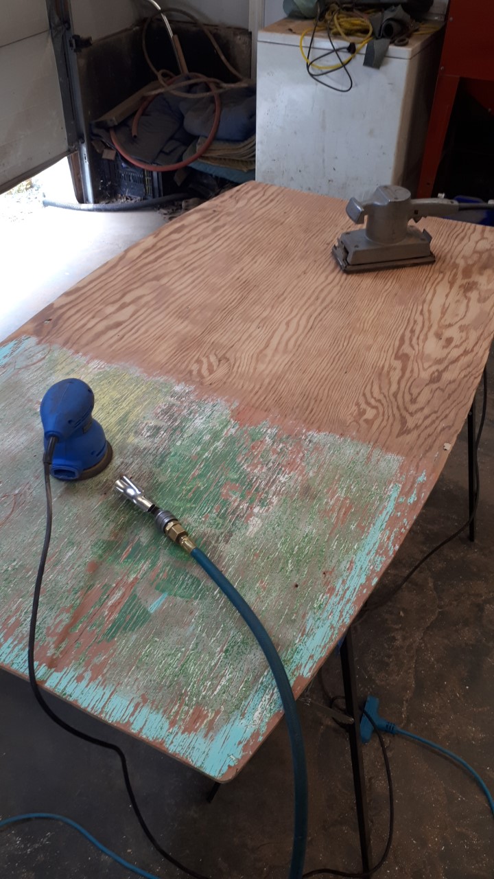
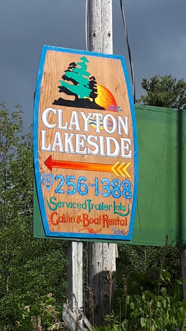
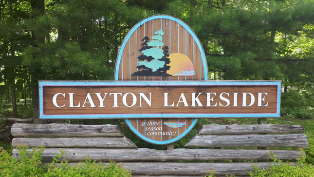
Clayton Lakeside asked me to make their Tatlock Rd sign stronger so folks don't miss the turn.
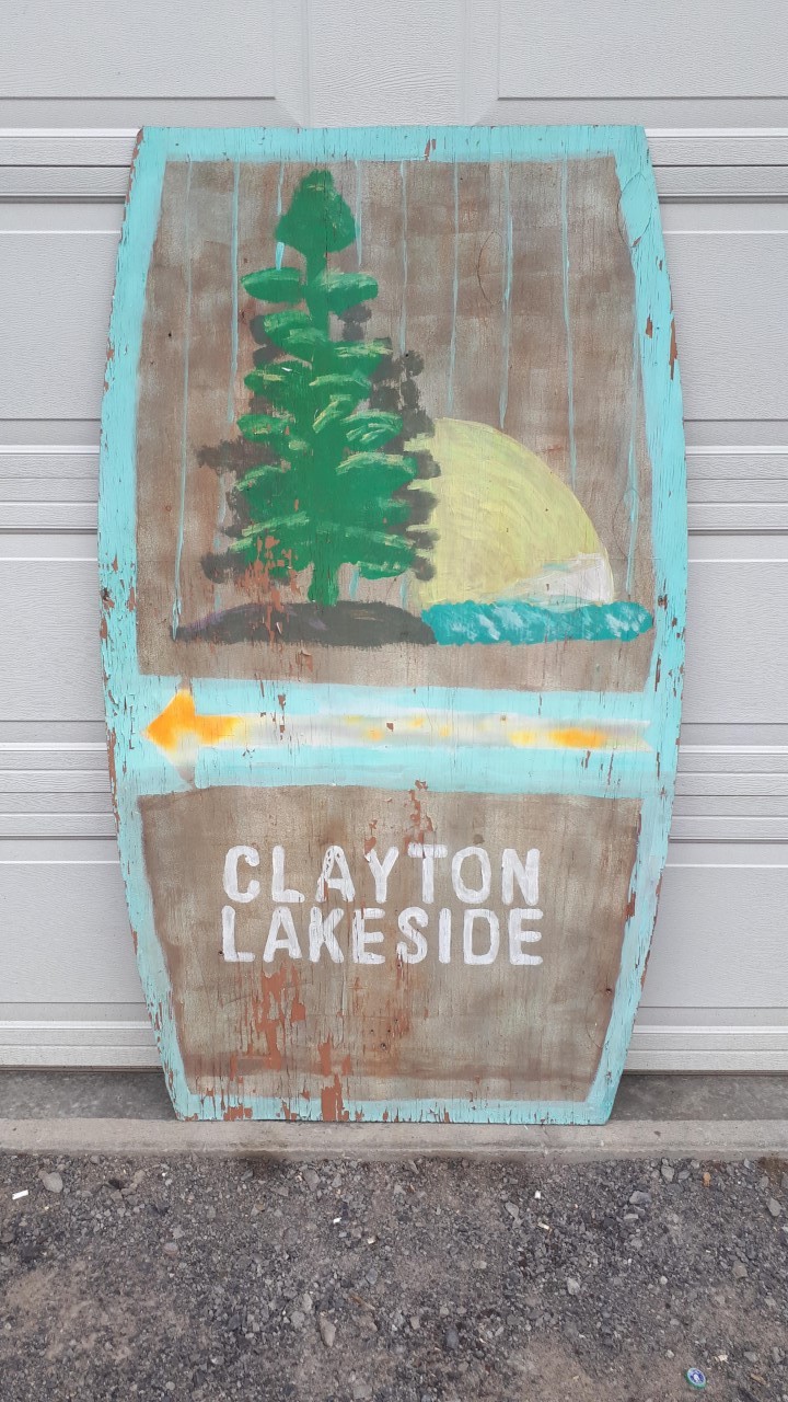
These first two signs were my starting point.
Sign one is the signature of the camp featured at its entry.
Next was the previous Tatlock Rd sign folks weren't quite seeing.
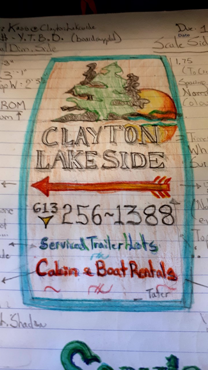
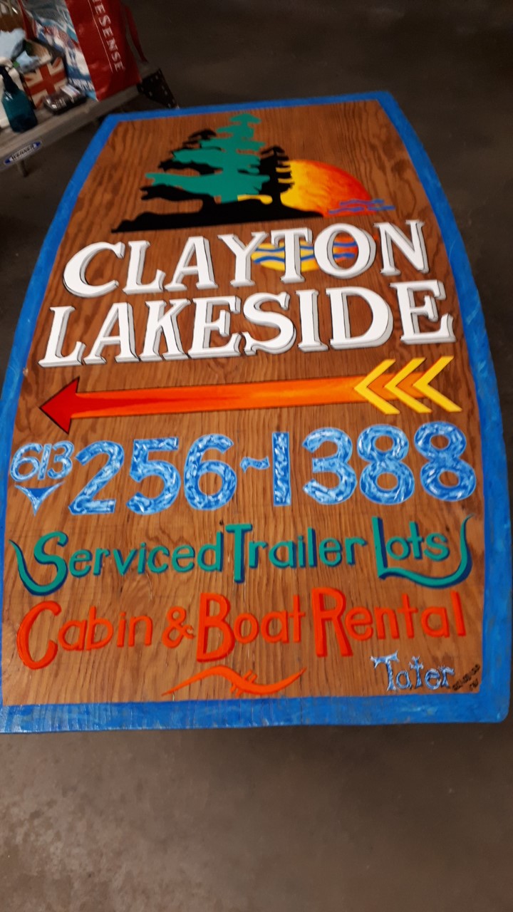
Now, after discussing any other info they want their sign to convey, my rendering.
Now, I take the sign, resurface the entire board, then varnish for a clean start.
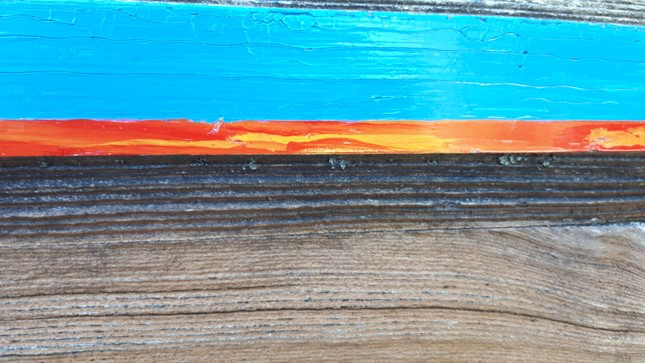
I wanted people to "Feel" the water of the resort, so I used a watery, blue surround as a slight deviation from the flat blue on original sign. Then I used another watery look in the phone number to make it pop, as well as add some more colour to the sign.
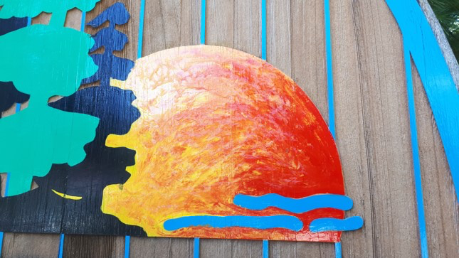
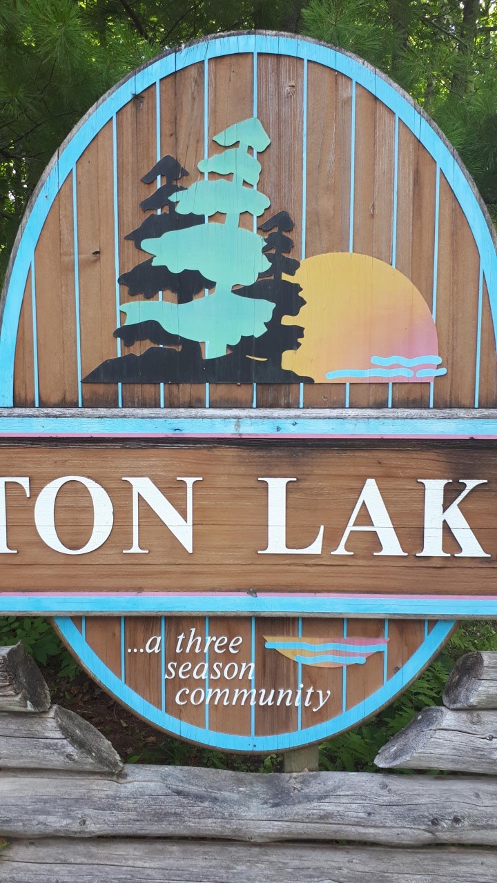
Clayton Lakeside asked me to help with a couple of their signs, and this poor faded fella was one of em... I did not want to alter the original too much... but DID give it a wee bit O’ Taterization in me own fashion all the same! Clayton is KNOWN for it’s stunning sunsets.... and this whole logo is their flag, so I had to nail it or face the wrath of a whole trailer park!!!
Here we see the sun faded original at the gate/ entry... so, I began with a good wash down and loosened and sanded flaky paint away to make some real estate for my fresh One Shot!
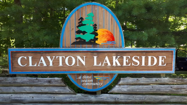
Staying true to my intent, this made the colours pop a bit more and give it that edgy Taterized snap!
Because the sunset’s reflection upon the lake is SO sacred to these sun worshippers... I infused the sunset into the border around the blue to honour that special bond between lake n’ campers.
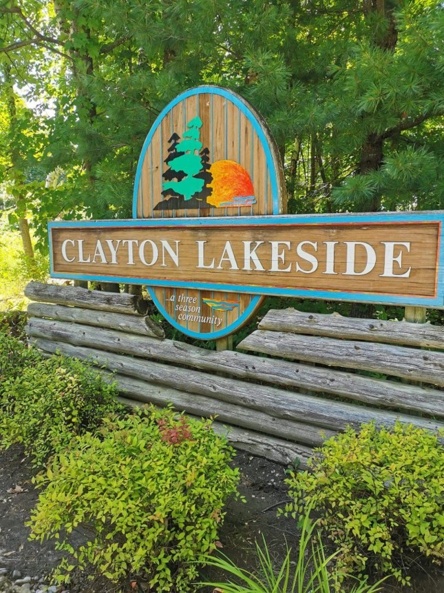
A fresh welcome to residents and visitors alike!
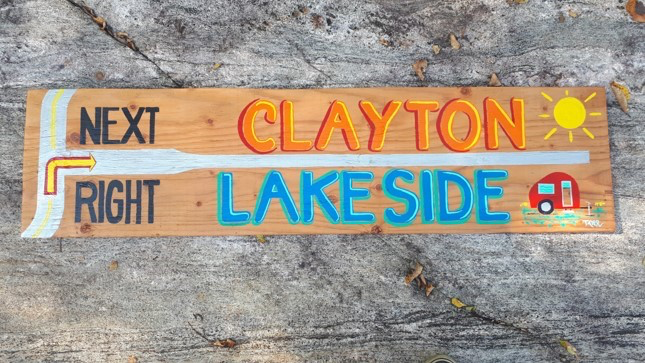
For folks coming FROM Clayton Village – It’s a tricky, blind “S” turn....
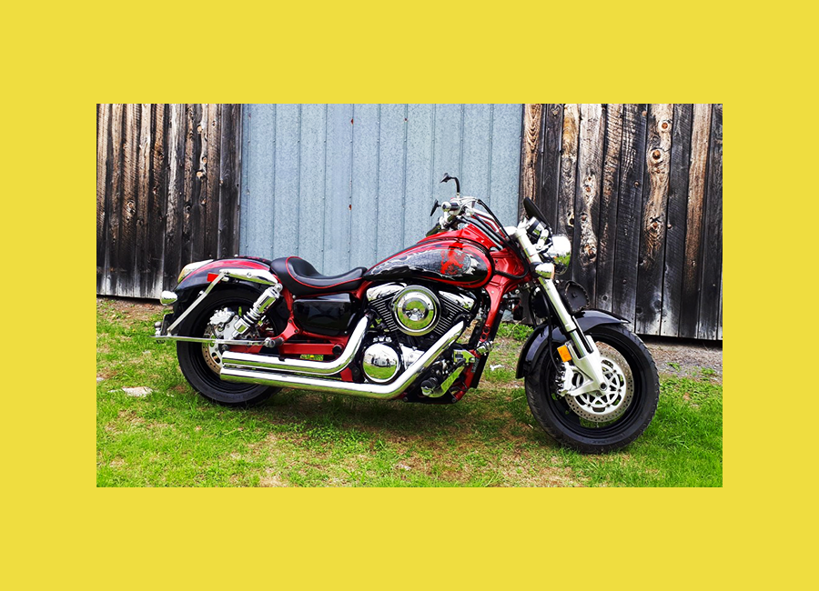
Let yer Soul Shine! Let’s make your baby “YOU~NIQUE!” Tell Tater all about what makes your heart soar when you’re out playin on your pride n’ joy, does it have a nickname, honour someone, or a theme.....? Together, we can Taterize yer Freedom Machine to suit the spirit that rides it!
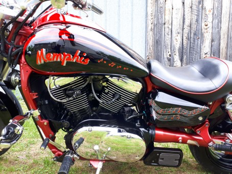
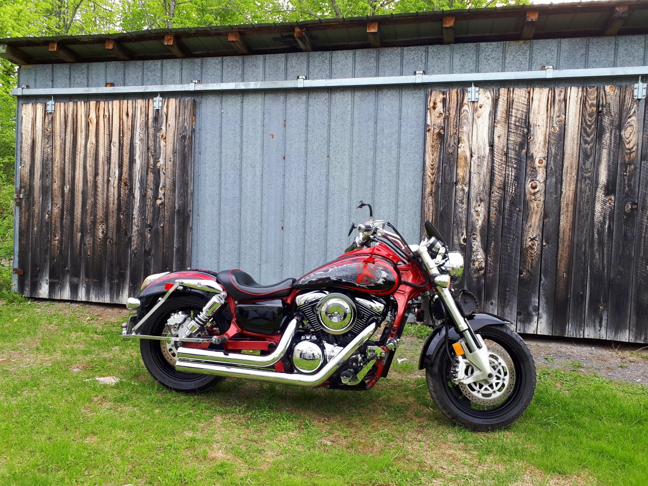
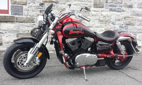
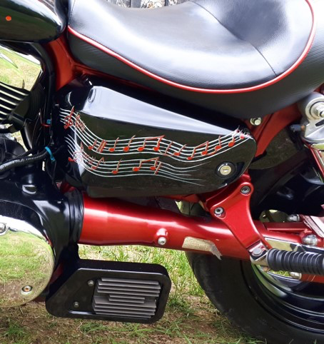
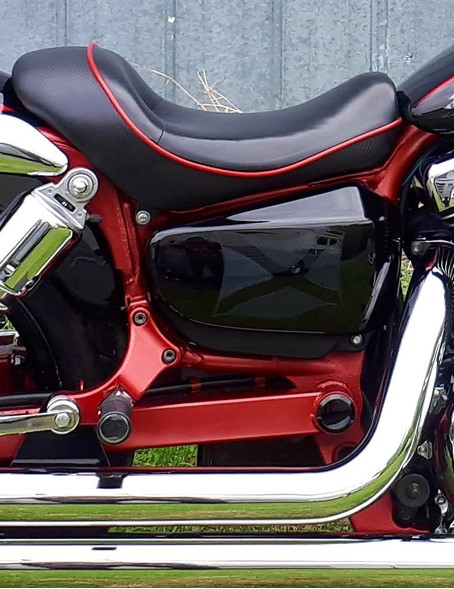
My own freedom machine... 1600 cc’s of pure ridin’ joy ~ this fella n’ I have seen some road! This bad boy’s taken me all the way to Beale Street for the real deal... HOME of The 🎶🎵🎼🎤🎸🎷Blue’s peeps!! His name has always been Memphis because of my deep appreciation for this musical gift from Tennessee and beyond... On the “Flip Side” I chose to honour my family’s Scottish Heritage. Truthfully, I actually had to do some patch work after dropping it on GRAVEL in a moment of stupefication (involving the tossing of a bag into a garbage dumpster.... ahem) – YAH.... Alas... t’was time to put my money where my mouth was and bust out the squirrel tail brushes n’ One Shot and start my journey as an aspiring pinstriper.... I humbly present..... Memphis
Memphis in the Meantime” chorus line ~ by the Legendary John Hiatt.... kiss the sky for such talent! – Yay MUSIC!
Got to try on my passion for autobody work – an art in and of itself!
Lion Rampant upon castle wall tank blow out... my objective here was to make the tank appear as though the castle and lion were bursting out of the tank...
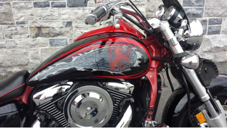
Scottish flag often referred to as St. Andrew’s Cross ~ or The Soltaire – typically royal blue with white cross.
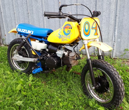
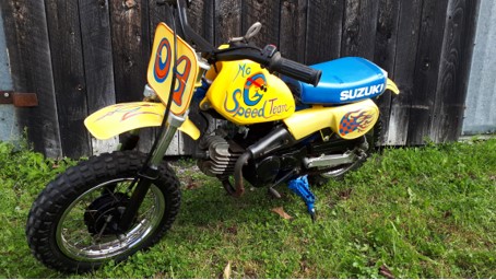
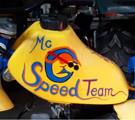
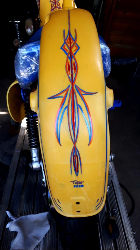
This dirt devil was enroute to some pretty excited wee ones with the last name starting with Mc G.... Wanting them to feel as much a family as they are also a TEAM... I came up with this fun concept and stuck to the basics keeping the playful bursts of primary colours runnin strong throughout the Taterization!
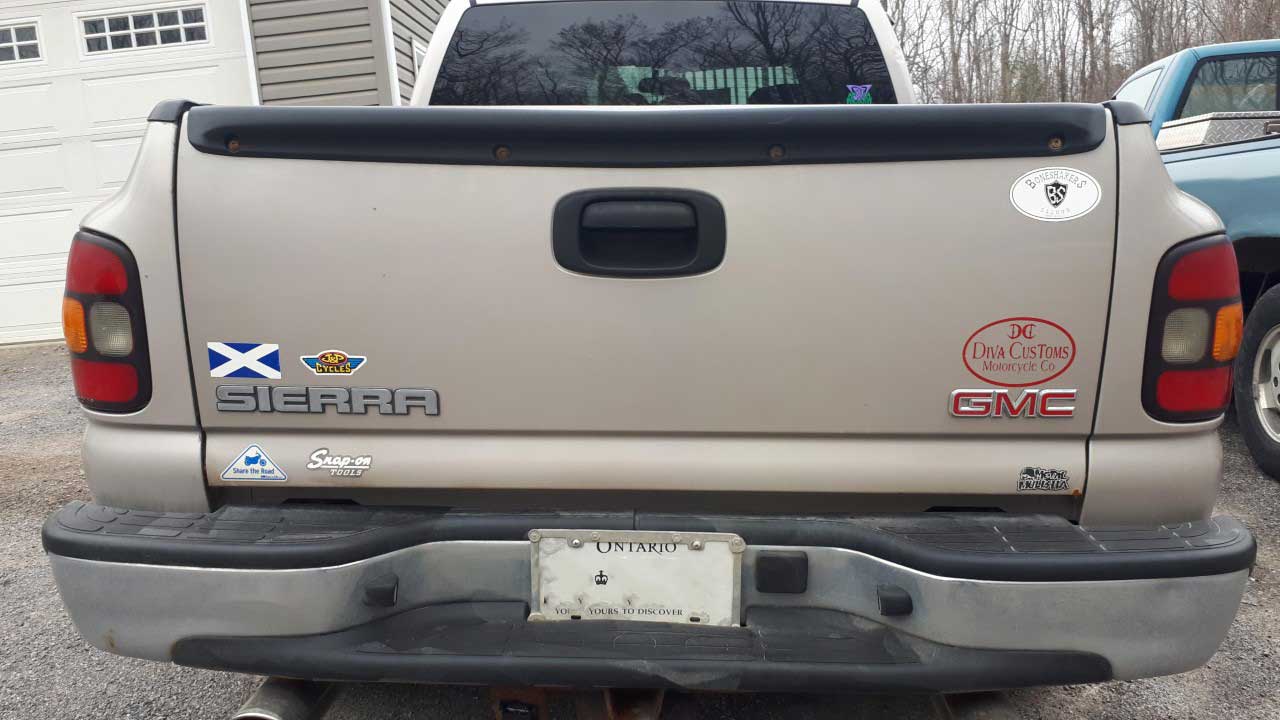
before shot.
Sun faded and out of use.. this poor wee trouble maker needed some detailin T.L.C. and a wee touch O’ paint to freshen up the chipped and faded metal bringing this 70’s gem back to life before I laid some classic lines to match it’s retro look...
Here’s how I played with the letter G from their family name to create a cool dude to cheer them on!
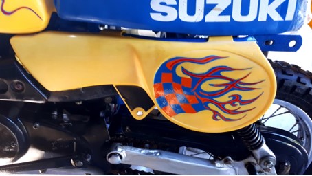
Combined some classic racing symbols such as a checkered flag n’ flames as seen here.... fun to play with these chunky, powerhouse colours!
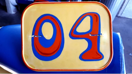
Four kidlettes = 04 Riders!
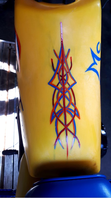
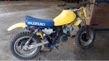
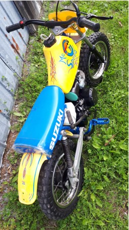
laid some classic lines on the tank
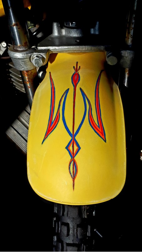
Carried pinstripe tradition to both fenders to tie it all together!
Bigger kids eye view
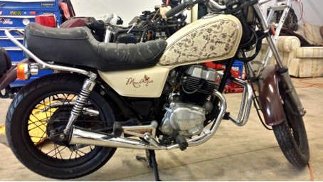
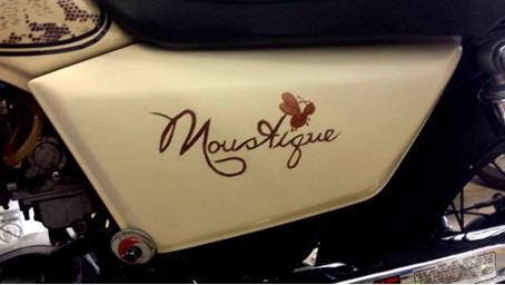
This Lady painted her own tank, but was lookin for somethin’ a little more to let folks know just who was buzzing by!
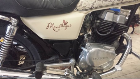
For her French nicknamed Moustique trnsl = “Little bug” – this lady rider also wanted it to be playful and feminine, while colour matching the bike’s café latte, retro look.
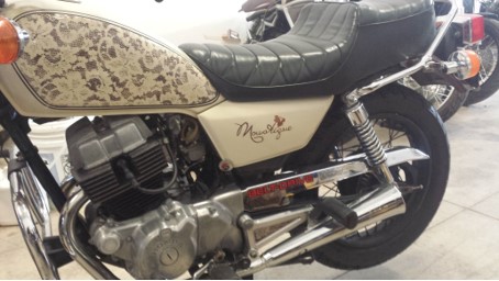
Flip Side
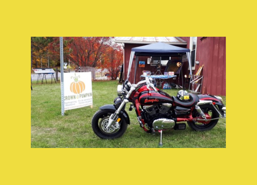
The annual Arts & Craft tour takes place in the heart of the Almonte and Clayton area in Eastern Ontario. More info here - Crown & Pumpkin.
Tater’s is pleased to be welcomed into this fun group of local artists featured on The Crown N’ Pumpkin Annual Art Studio Tour! Crown & Pumpkin 2019
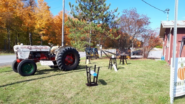
Having an artist featured outside a venue was a 1st for this local studio tour and with all my fun, huge pieces – it was kinda the only place for us! Here we all are on the front lawn of Union Hall at Wolfgrove & Tatlock Rds.
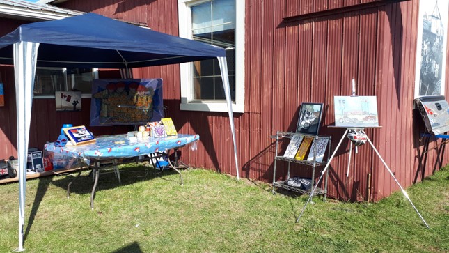
All my small pieces and canvas work set up for the show!
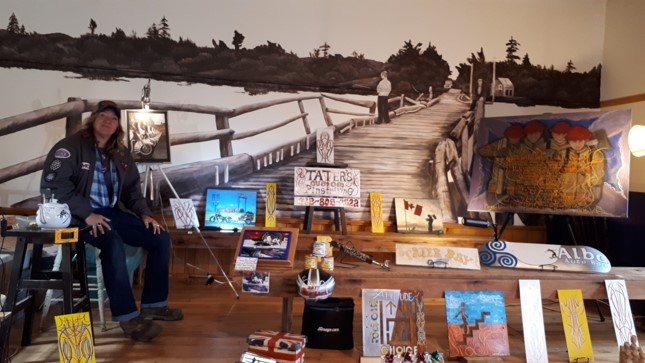
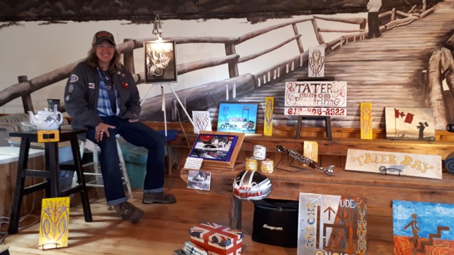
Plan B” ~ Inside on a rainy last day!
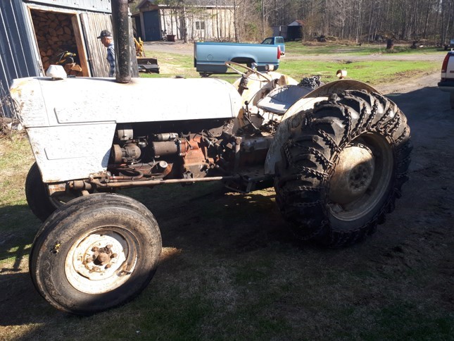
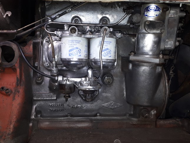
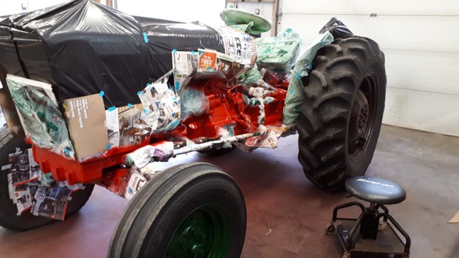
Got a beloved family tractor or piece of equipment needing some more get up n’ go? Maybe they just need an oil change and a wicked Taterization to bring out their hard workin spirit! ~ They need the oil change... c’mon ~ you know it.... Tractor LOVE! 🚜

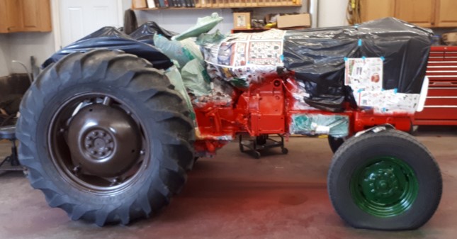
This project was immense, but worth every stage and “What was I THINKING?!!??!” moments along the way!
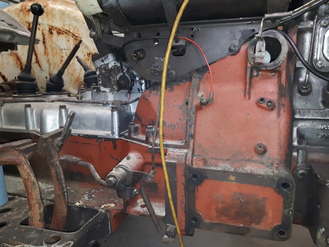
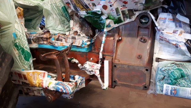
Before shots...

Cleaned and stripped this of the flaked brown paint and grease n oil to reveal a rugged, raw metal look… shot high heat clear to slow the whole thing from rusting back too quickly!
Tonnes of cleaning and paint stripping done LONG before any painting party got goin’
Tape anyone?
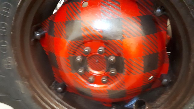
Tape show over… reveals the “Green for GO!” pedals.. n’ “Red for Whoa!
s’more tape…..
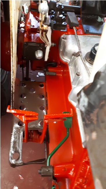
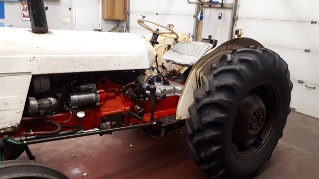
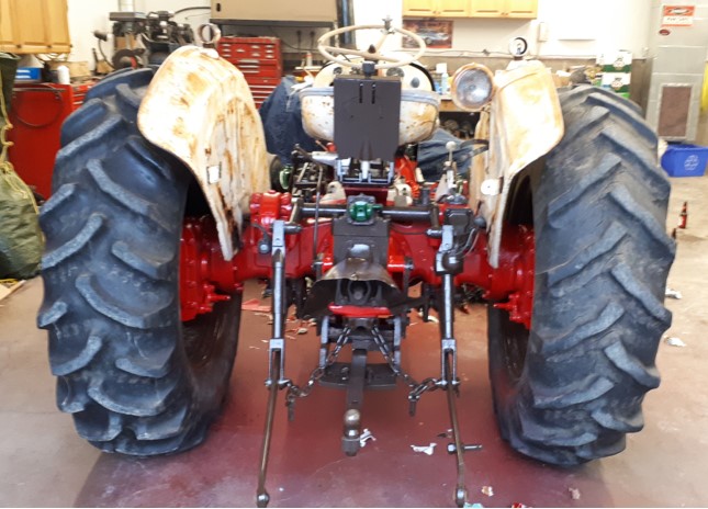
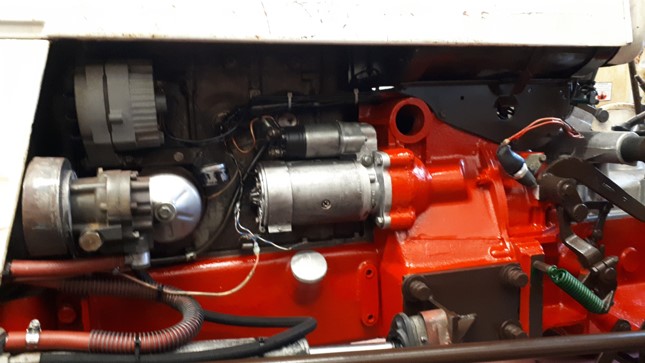
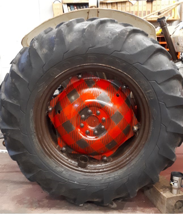
With the frame, engine, pedals, levers and rims painted… it was time to move on to next phase!
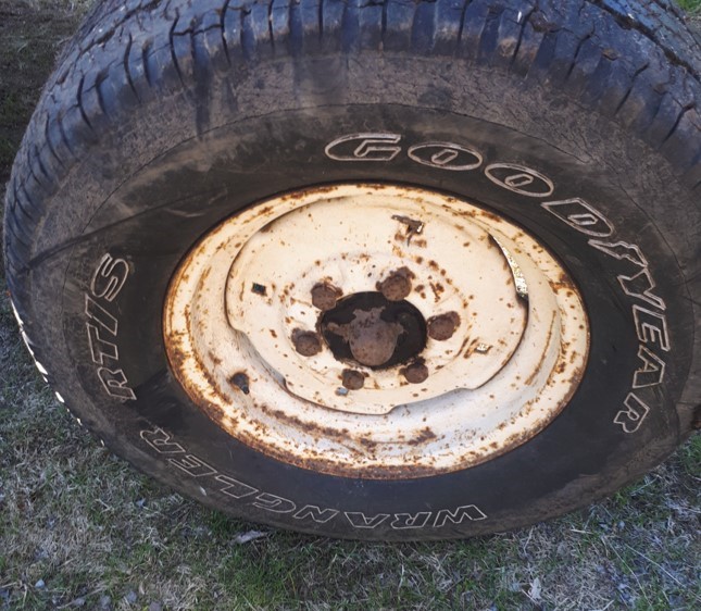
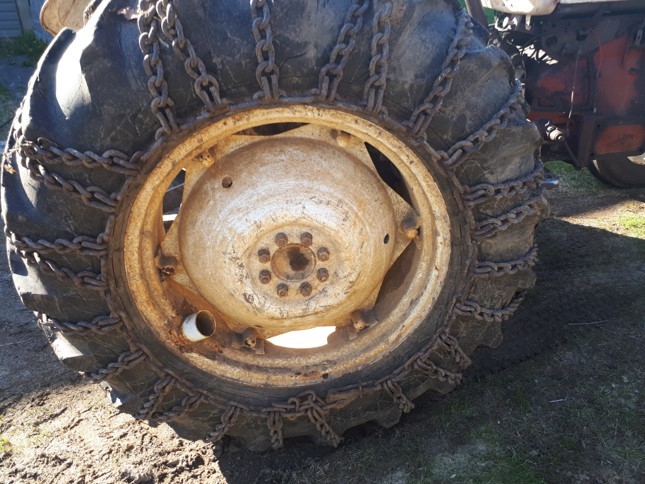
Rims n Wheels - Before Shots
Base on both front n back…
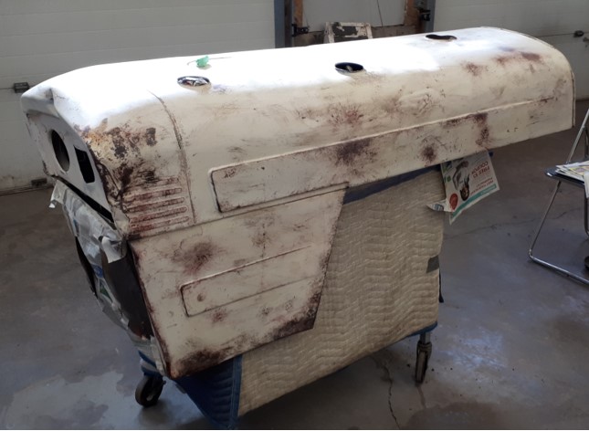
Hood – before
Hood work over…
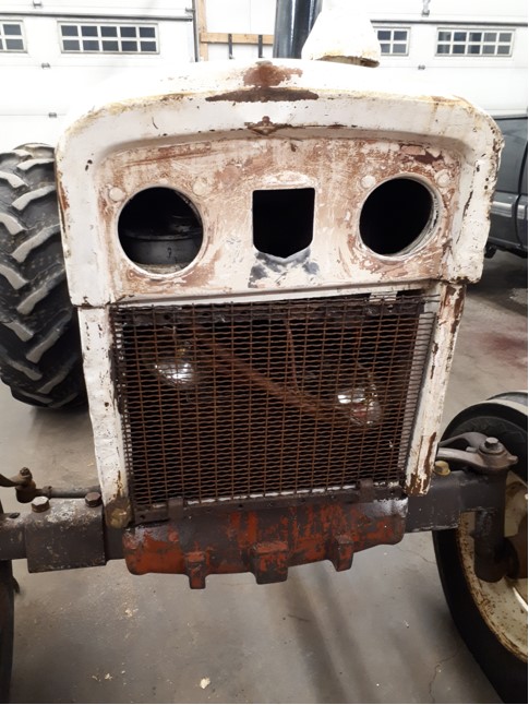
Face ~ before
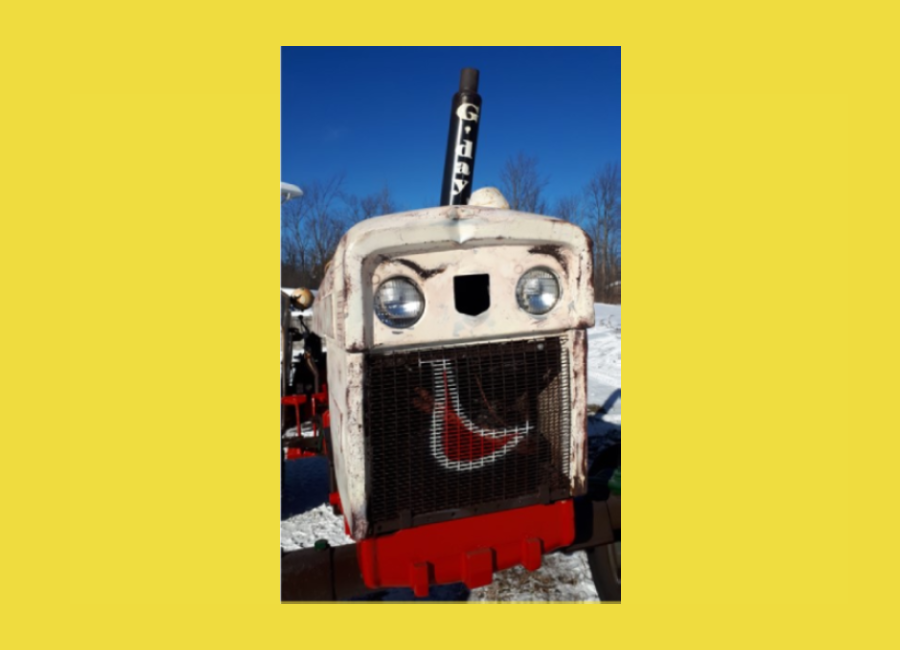
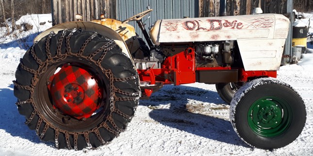
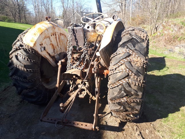
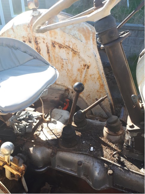
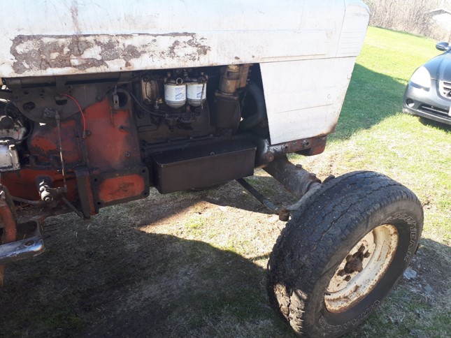
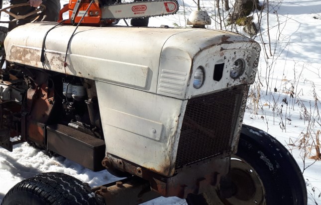
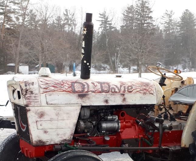
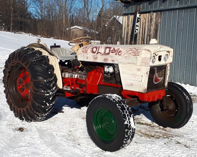
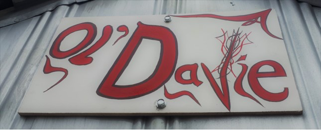
Ol’ Davie was just a screamin’ Rat Rod to start with… so if it ain’t broke… don’t go tryin ta fix er…. Make it MORE….
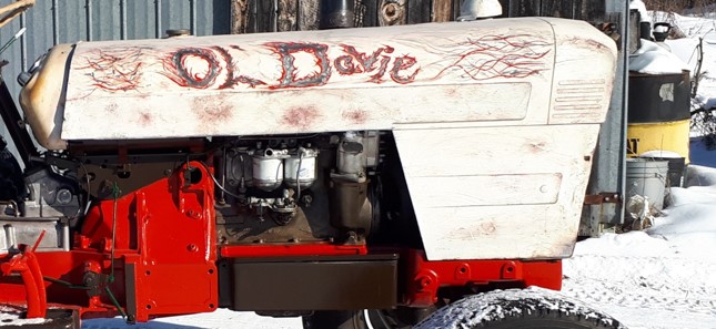
Rat rod becomes Rat-tractor-Rod ~ Ratractorod…. Yeah man.
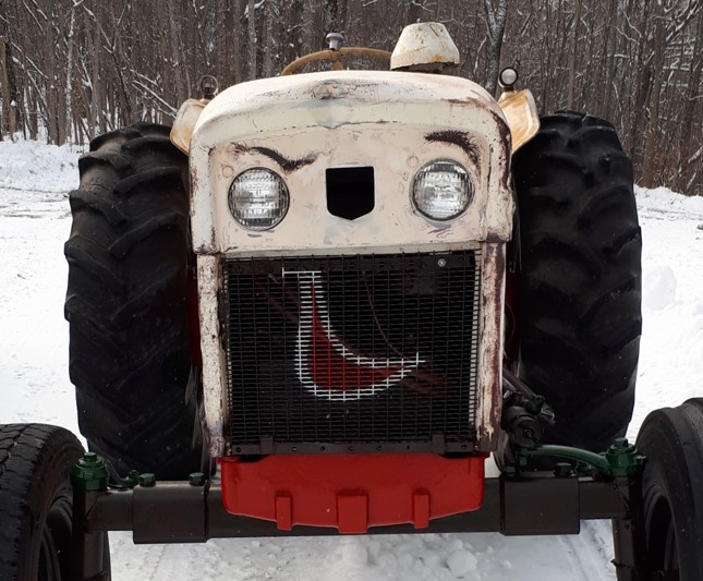
Check that determined git’er done expression! Get em Davie!
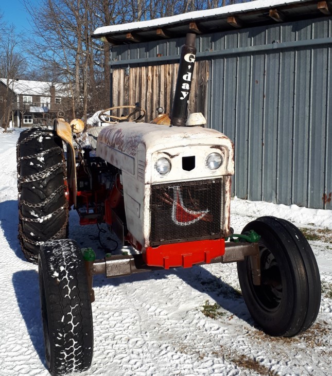
Standard Lanark County greeting....
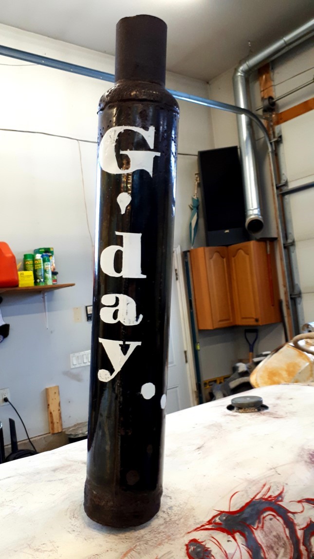
Ready for a whole new adventure!
Flip Side
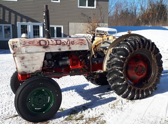
G’day.... ~ Thanks for checkin’ out the project!
(well, he is to me, anyways….)
Added a crossfade of red into black down the frame for a funky rat rod look.
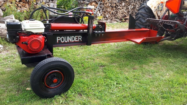
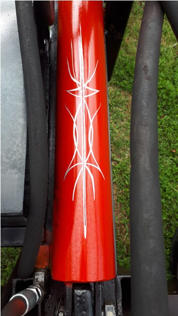
Hydraulic cylinder for the ram
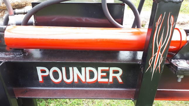
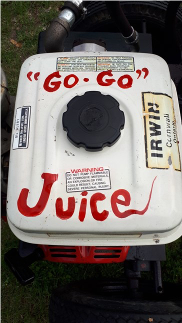
Gas tank ~ Nuff said
inside splitting wedge cause, Why not?
Oil Reservoir
Oil Drop Guy ~ A hot rod classic!
Use of company logo on functional tools, such as café or pub gear.
Tater can also create an original logo as seen below...
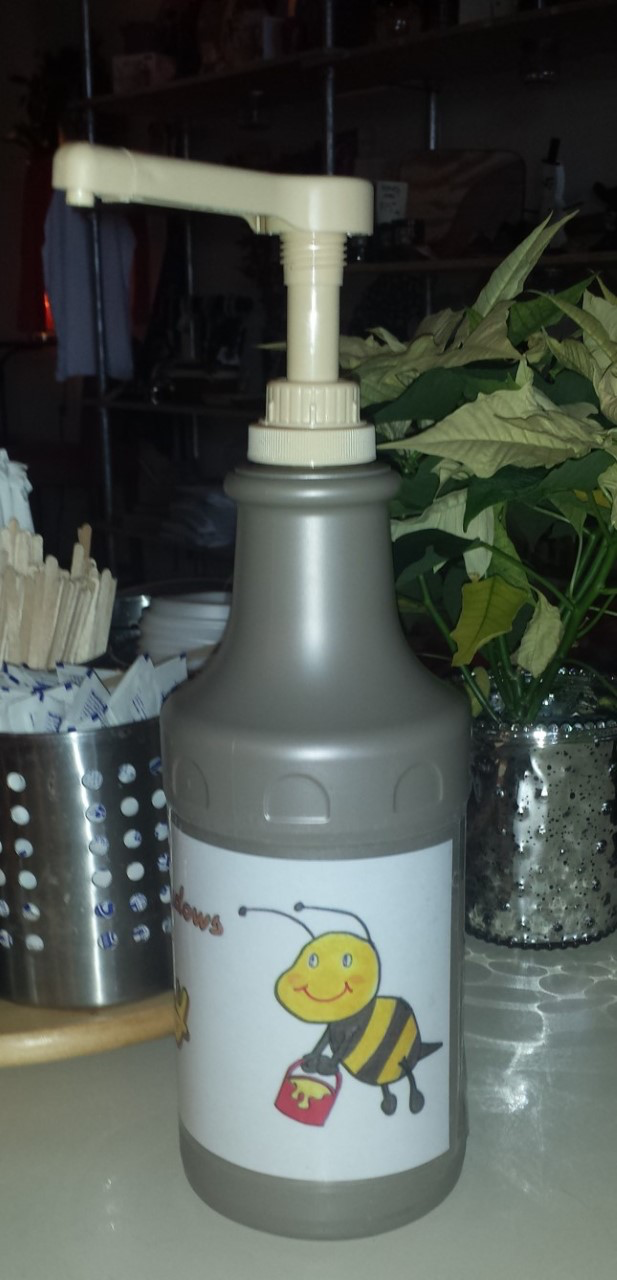
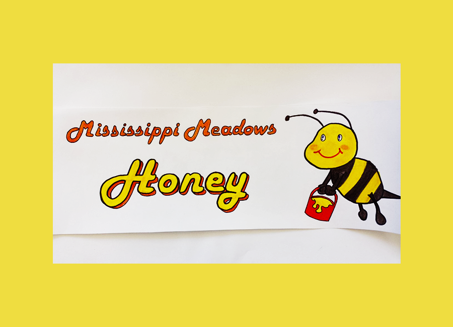
Mississippi Meadows Honey
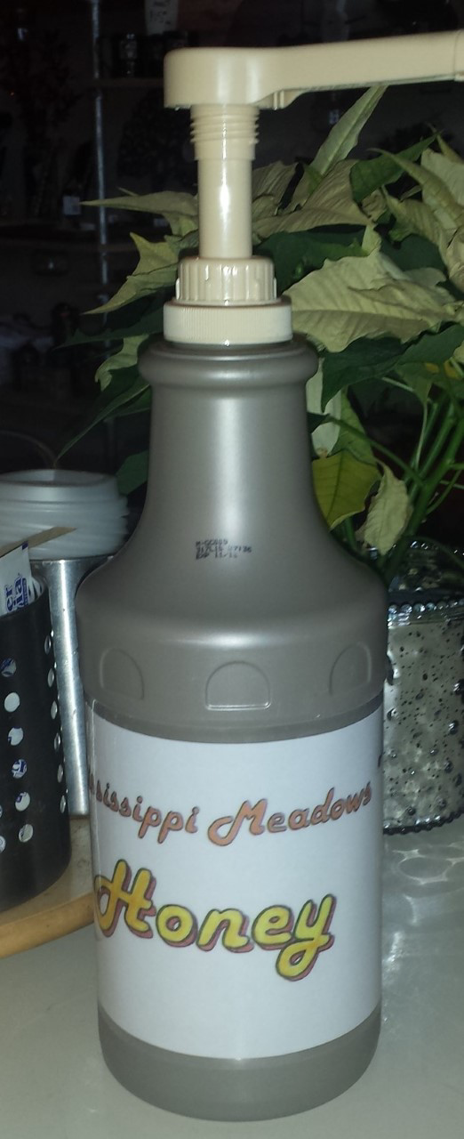
Equator uses this awesome local honey. The staff needed a good dispenser that customers could easily identify. I took a look at their company profile and came up with this fun design.
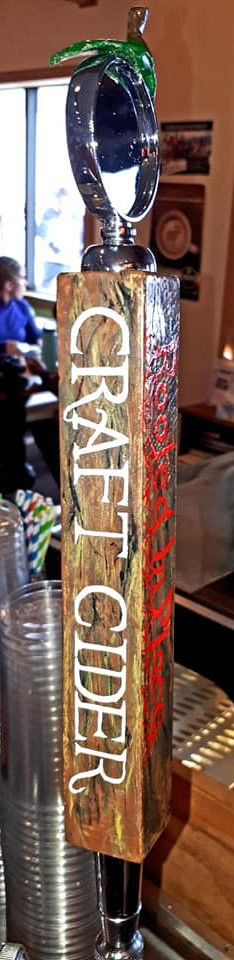
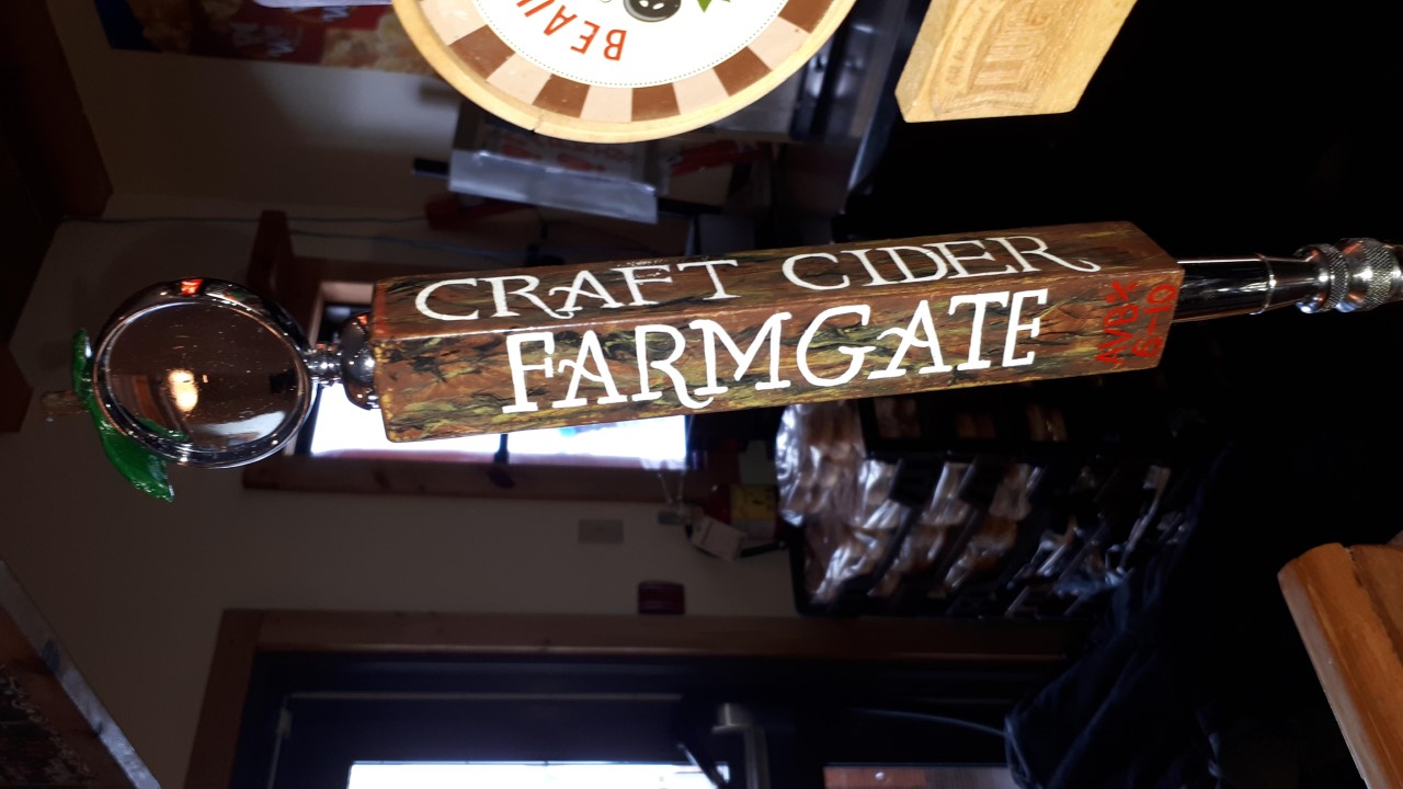
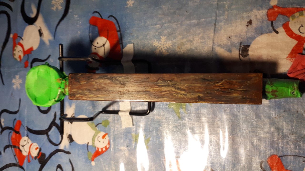
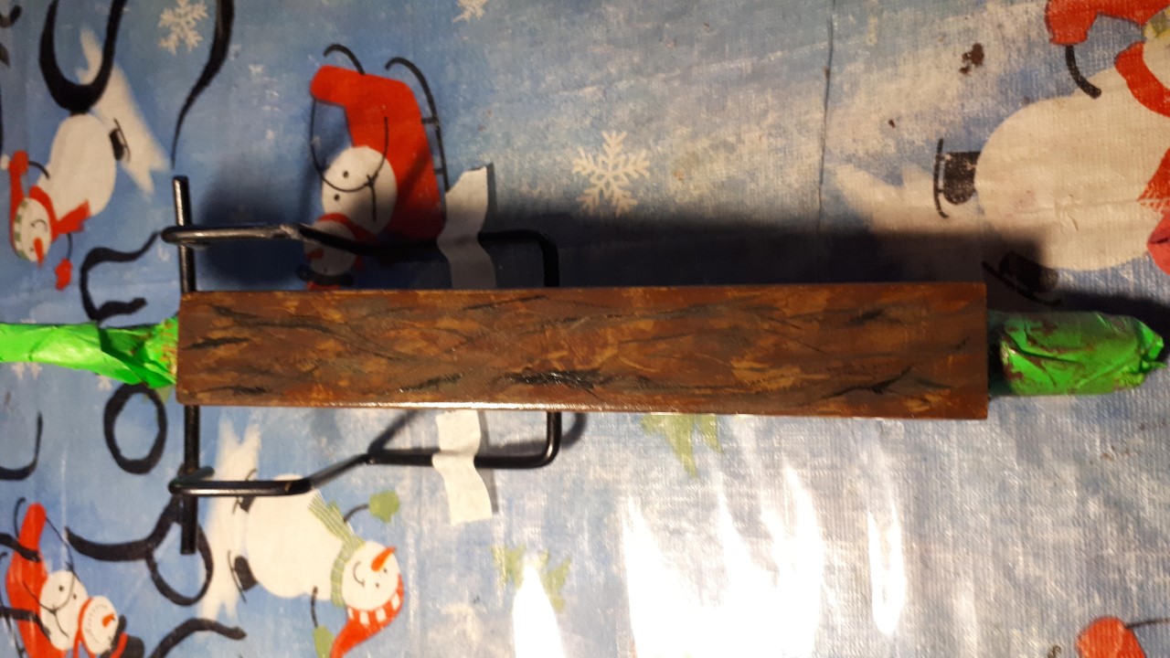
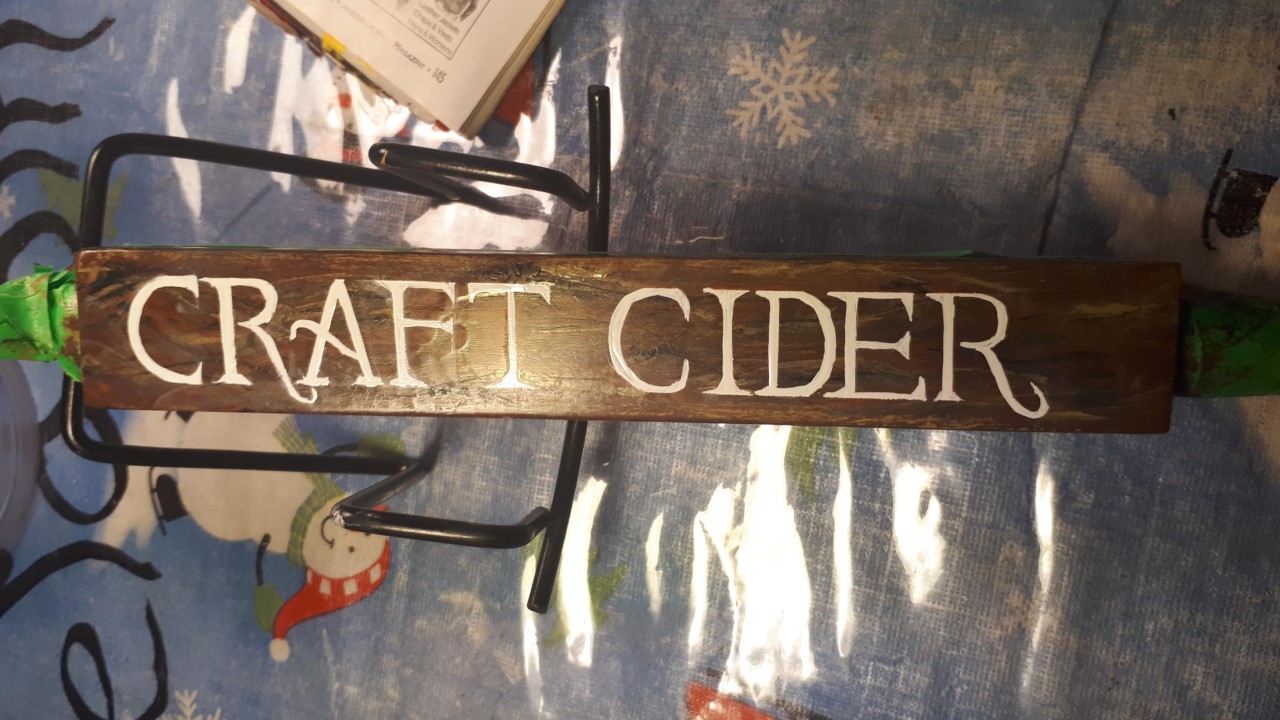
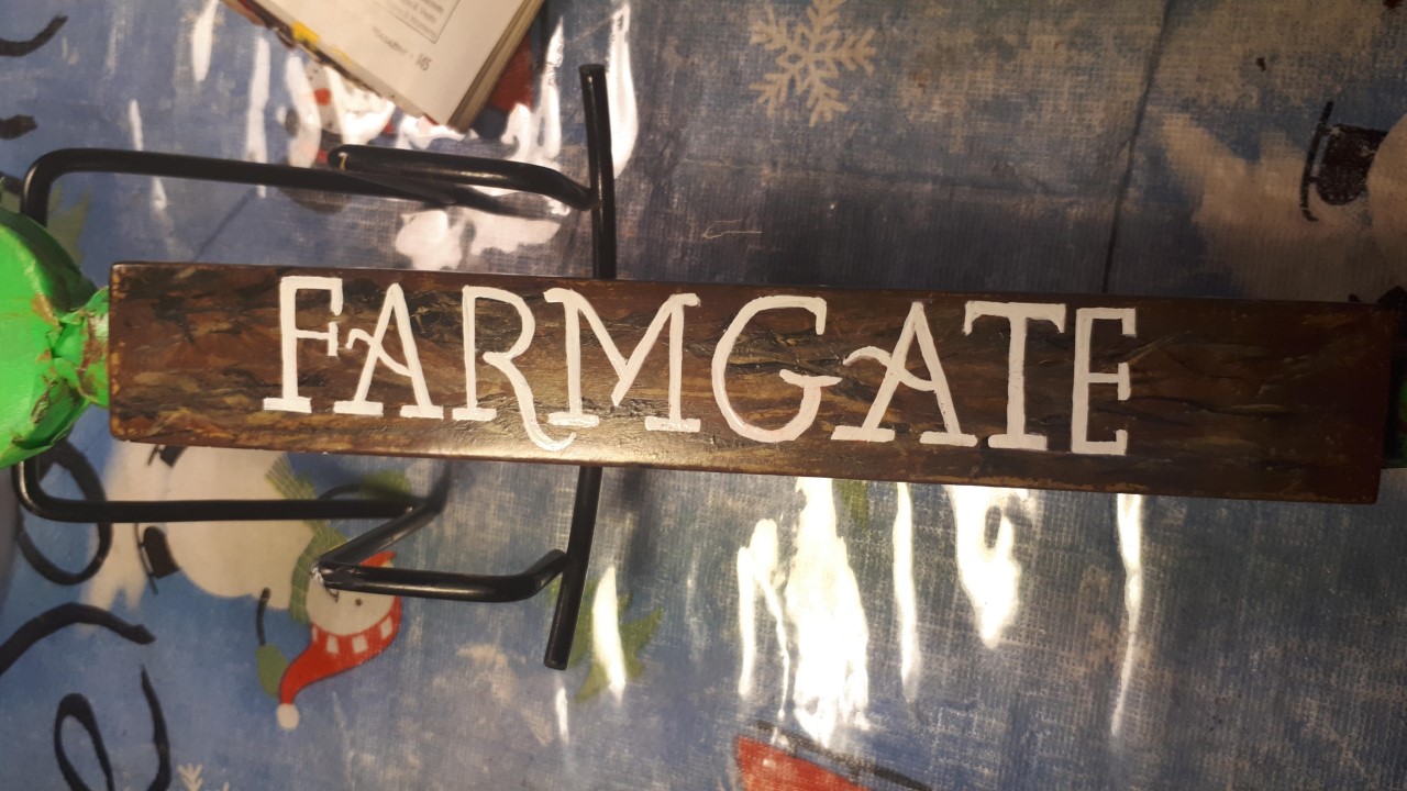
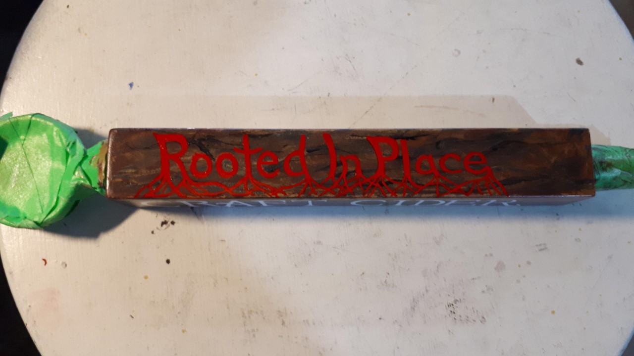
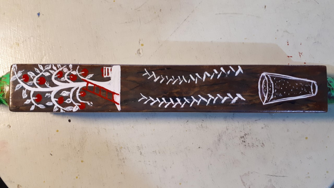
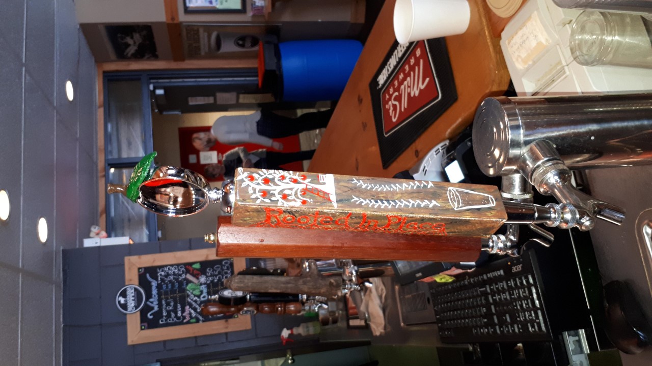
This bar was missing a decent tap for locally crafted Farmgate Cider. I asked the bar and Farmgate owners if I could design one and they were all pleased to let me come up with the following….
This handle was solid red and blue, so creating the natural wood grain look of the base was step one.
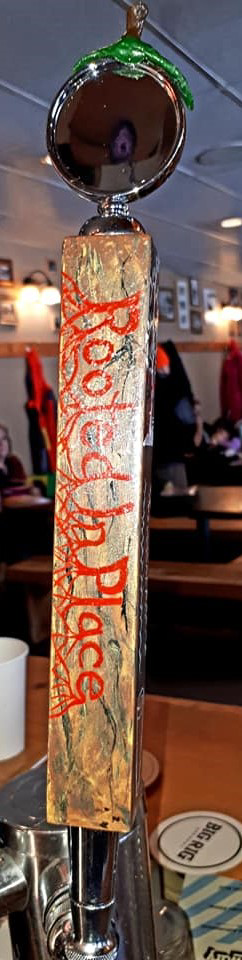
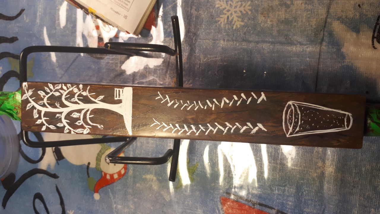
Note Apple Top ~ Played with “rooted” from company slogan.
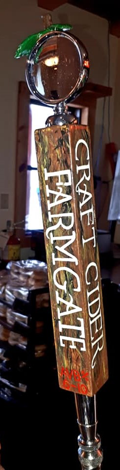
Researched font and other important company info for design.
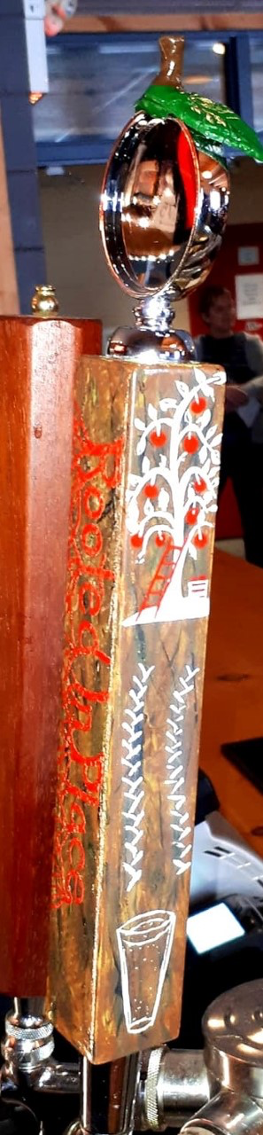
“Farm to Glass” ~ A Farmgate slogan
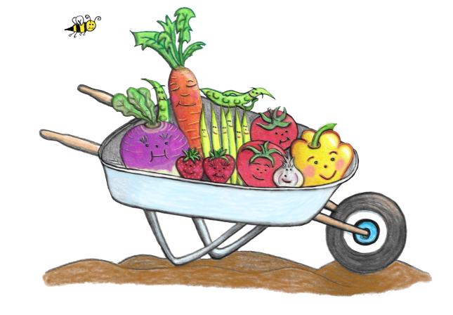
This local farmgal wanted a fun, hand made looking logo for her organic fruit n’ veg stand, “Fruitful Gardens.” The objective was to reflect abundance, the quality of her produce and careful soil management.
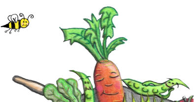
These veggies look happy and healthy! ~ Bee for abundance!
This handmade logo was later digitized for use on any company item, from business cards to company swag
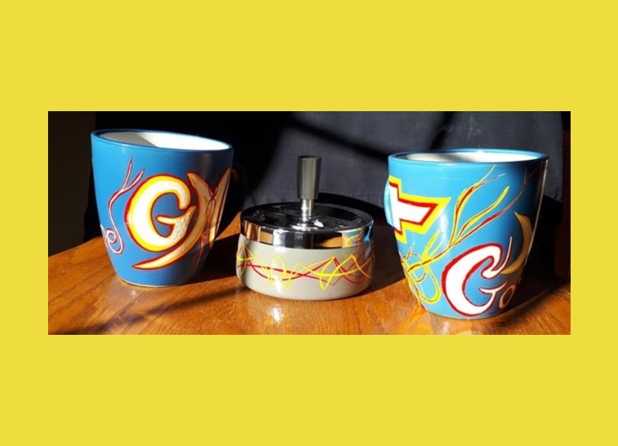
Have some fun with yer gear from personal items to drinkin’ vessels!
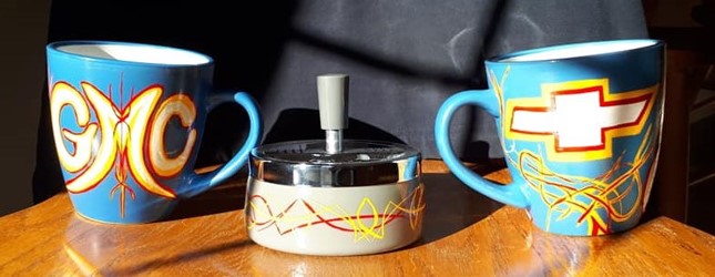
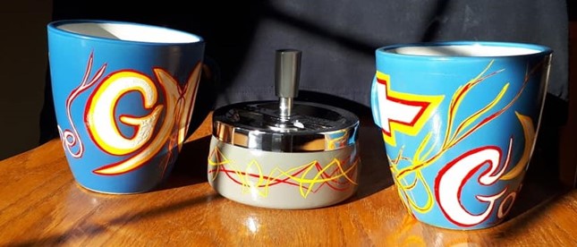
This playful His n’ Hers Motorhead Morning coffee set incl windless ashtray and features a General Motors theme for all us Bowtie Power kids out there…
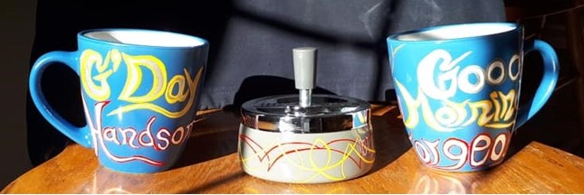
G’day Handsome ~ Mornin’ Gorgeous written on “fronts” of each mug… for a leftie man n a rightie lady
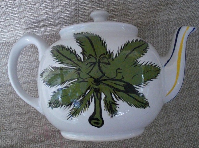
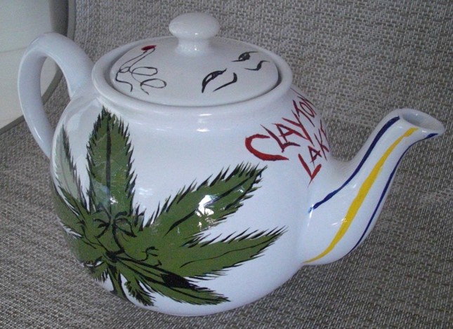
Motorhead’s Tea “POT” ~ Designed for a race fan with a love for certain places n other good stuff!
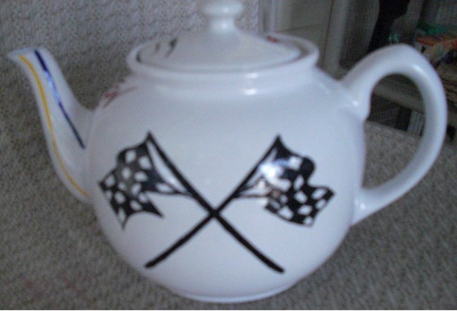
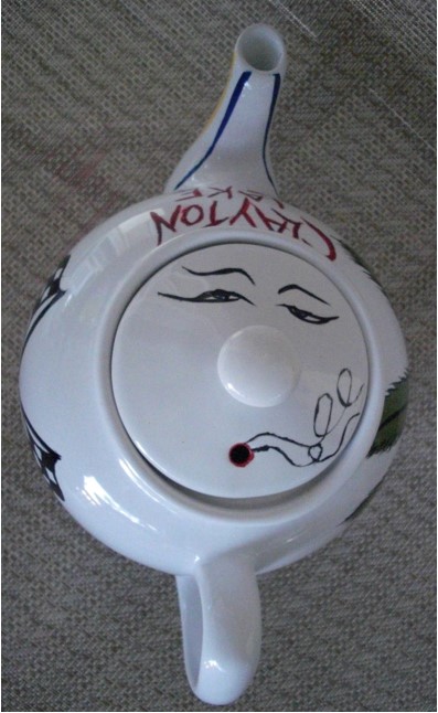
Had to get cheeky with the “steam” hole in top of pot...
Grinder for a fella with a playful nickname..
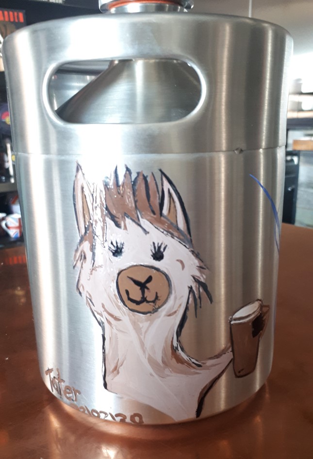
Craft beer growler with a No Drama Llama Theme!
Had to get my handle on there, too!
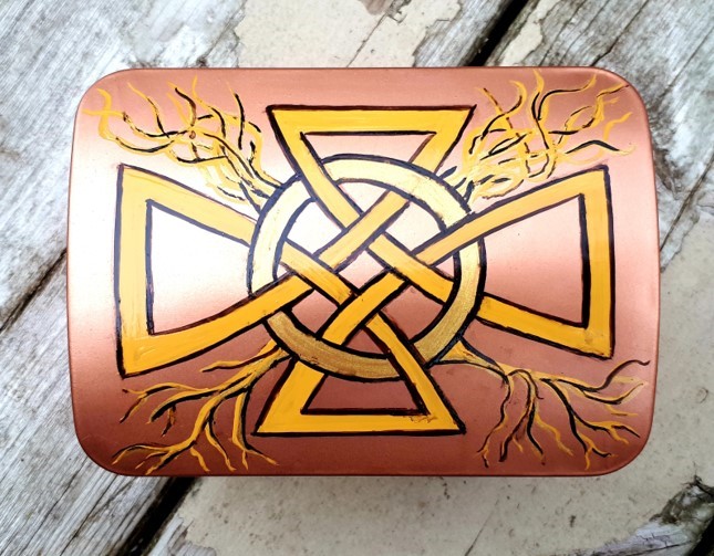
Celtic Box – This once slime green box becomes a funky, copper Celtic one....
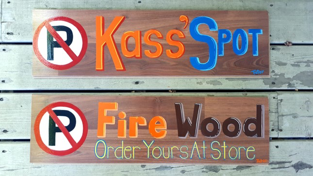
What do YOU need a personalized sign for… a favourite place, thing or…?
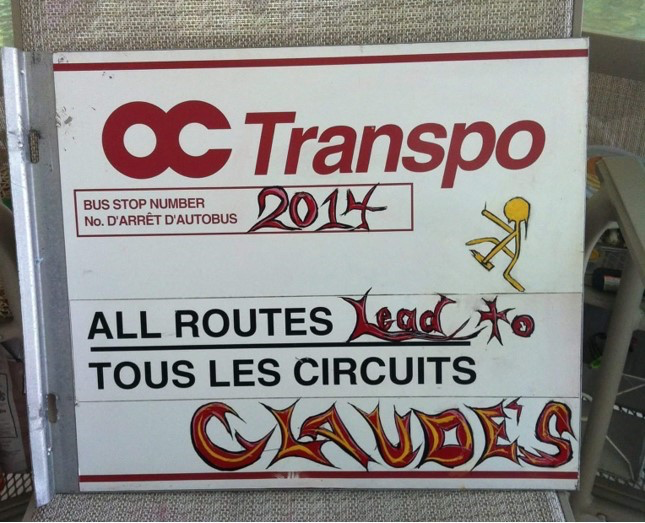
My first sign... made for a pal using an old bus stop sign - he drove bus his whole career...
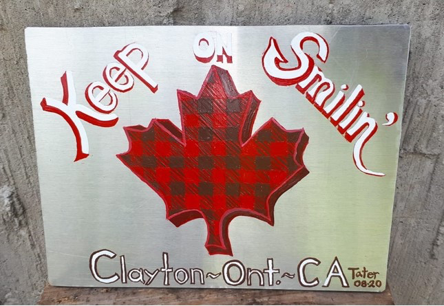
For a pal returning to England – Featuring his fave expression...
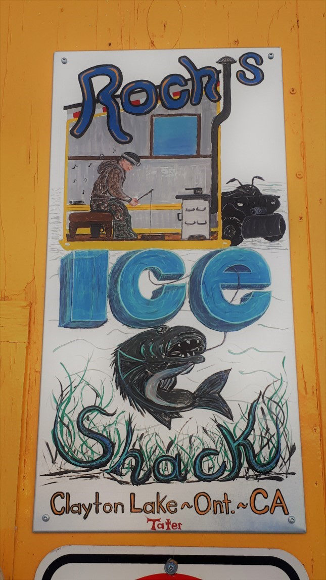
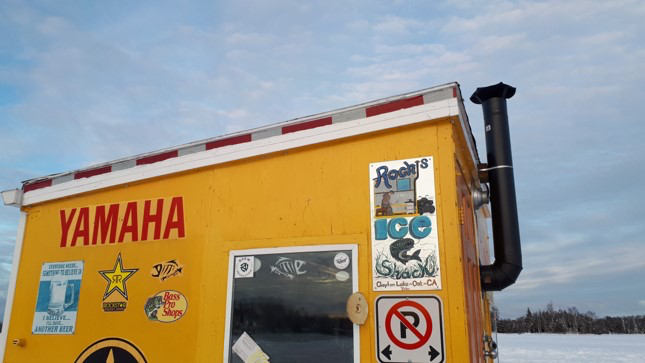
Roch’s Ice Shack ~ My neighbour’s pride n joy... I showed him inside with a cut away look into his world... He loves Walleye, music and his 4 wheeler, so I found a way to get those aspect in to give it a personal touch.... wonder how he will get that beastie up thru the fishin hole?!?!
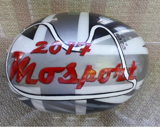
Austin Mini Cooper Mirror ~ Mosport Souvenir – this cowling flew off a crash and my race pals snagged er for me as a souvenir of my first Mosport Race! Had to Taterize for posterity!
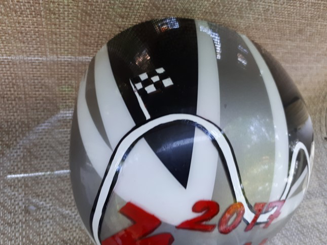
Had a little fun demarking our camping spot as well as the Finish line along Mosport’s track.
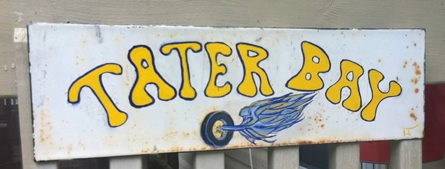
My lake cabin’s nickname...
Ol’ Davie’s Shed Signage
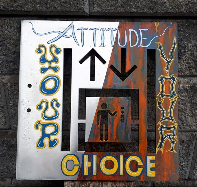
Choose yer ‘tude, dude ~ Up er Down ~ YOU Decide....
This sign works either way you read it. Choose the clarity of positivity, or the confusion of negativity – YOUR choice.... EVERY time.
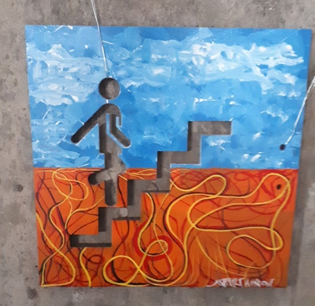
Ascension ~ Keep Climbin’
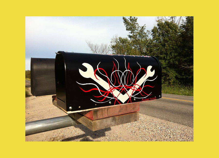
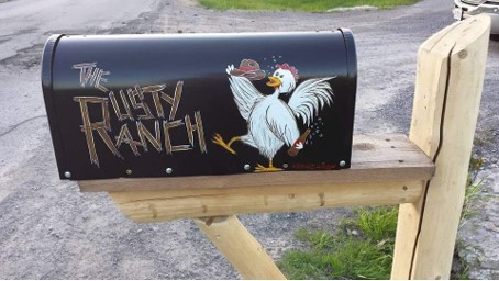
Have some fun with your mailbox ~ A great way to stand out beyond the colour of your house!
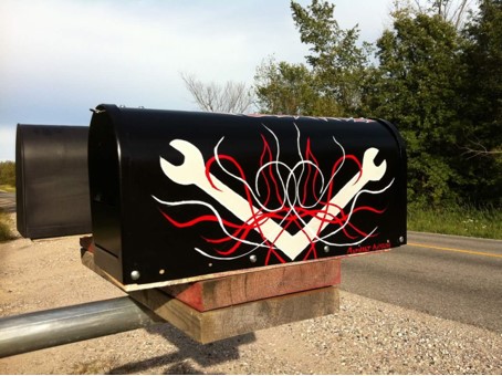
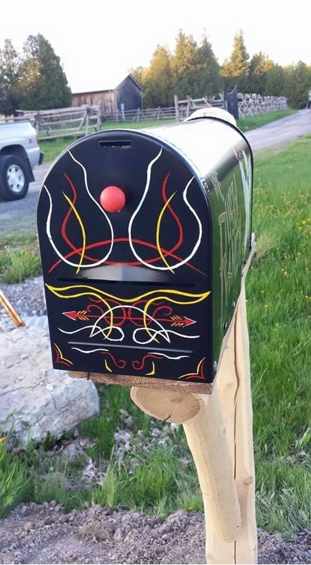
This themed mailbox was designed for an automotive tool salesman & Harley enthusiast.
Crossed wrenches with some playful traditional stripes
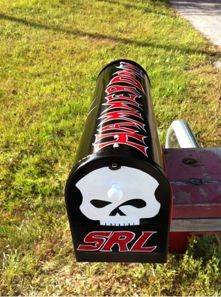
Harley skull w/ Snap on font for initials
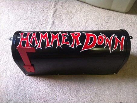
Hammer Down on top of box – fer all the drivers rollin’ Wolfgrove Rd
This was designed to bring smiles to the 2 young boys who live here. Their Dad kept some hobby animals to expand their world and this was a playful way to have a little fun with it all.... Dad MAY also like the odd glass O’ vino!
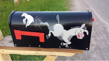
Here, with a little artistic license, I added their donkey and one of MY own fave farmyard friends ~ a lamb.
Stuck with a basic, South western style O’ pinstripes for the front of this box
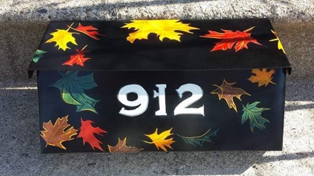
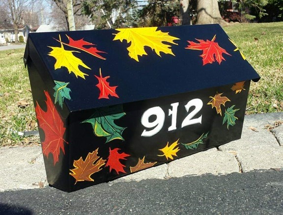
This homeowner LOVES the autumn & it’s glorious colours...
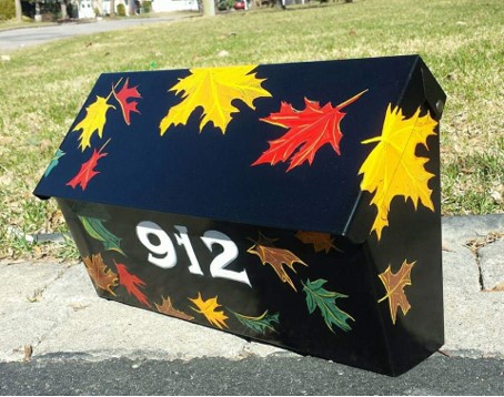
made the leaves blow all around the box for full Fall effect!
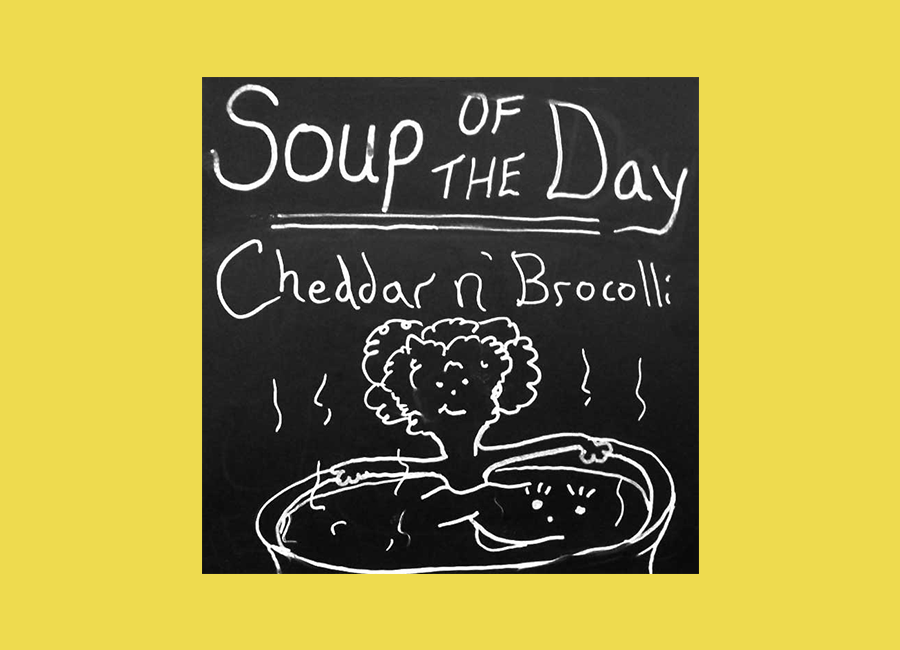
A slight step aside from traditional pinstriping, these chalk signs “still qualify” as noteworthy in a pinstriper’s world since they ARE SIGNS!
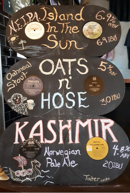
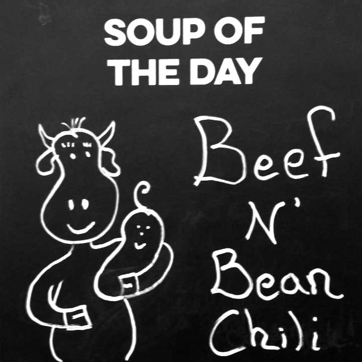
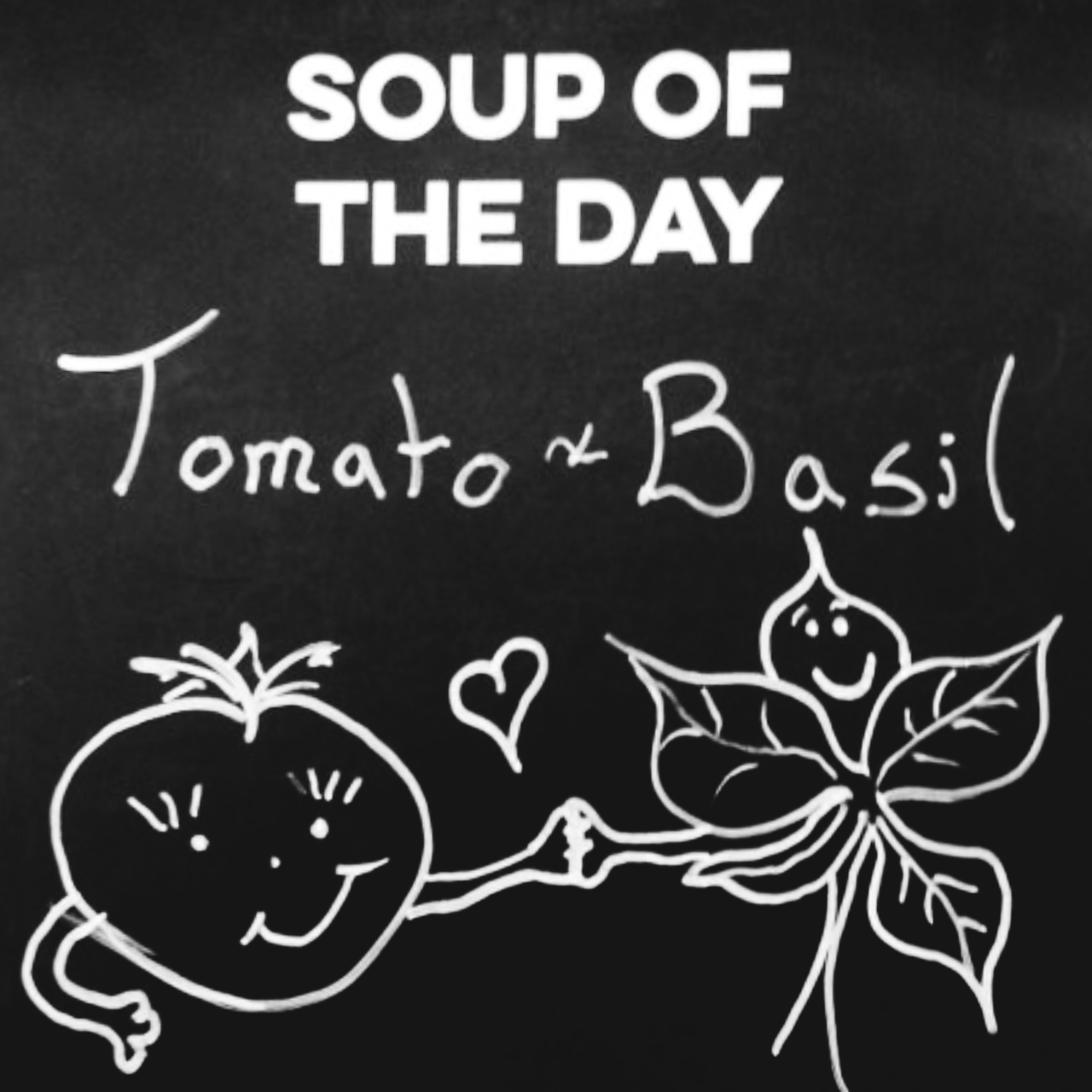
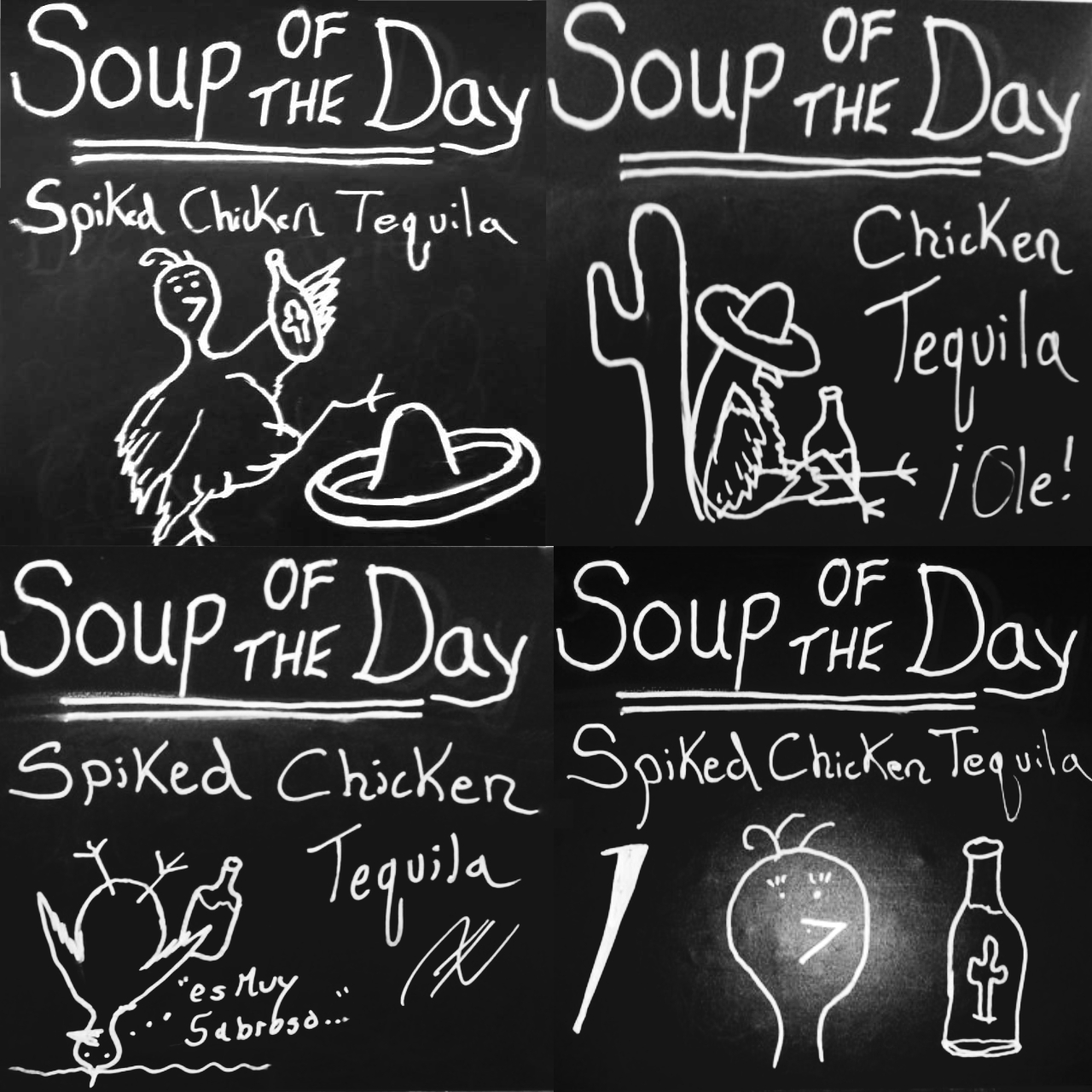
Beer festival chalk board made of old, SCRATCHED LP’s * NOTE – NO VINYL was injured, destroyed or disrespected during the creation of this menu board for hand crafted beer that HONOURS Rock n’ Roll, peeps! 🎶🎸🎼🎷🎵
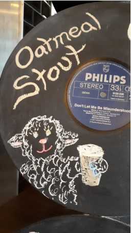
Lamb Approved Stout ~ Naturally…
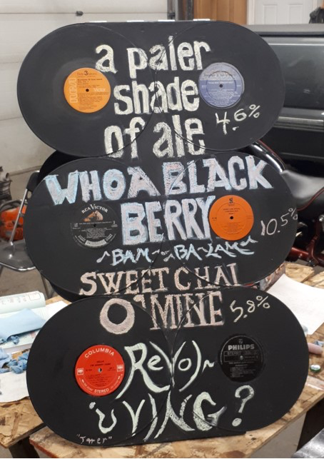
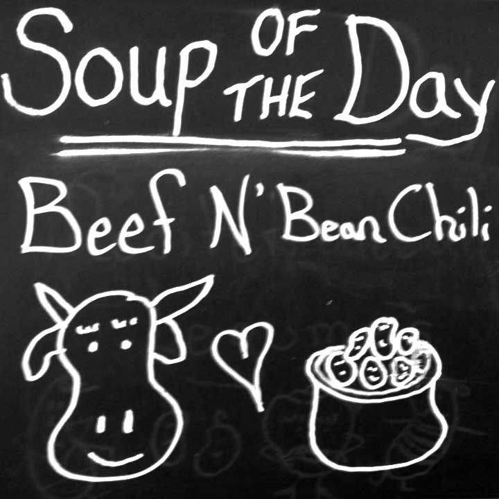
Designed for Ottawa’s Landsdown Beer Festival ~ This brewpub names it’s pints after inspirational tunes... check out that flava board! One tap “revolved” over the weekend for variety’s sake.
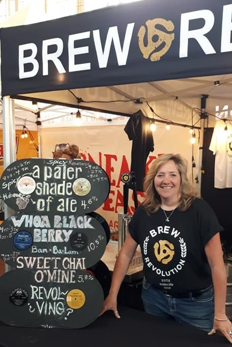
A happy artist serving rockin’ 🎶 pints!
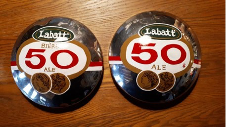
Labatt 50 Baby Moons ~ Hot Rodders Delight!
These Baby Moon centre caps were designed to go on The Ratractorod, “Ol Davie” ~ His front wheels were painted same green to make em pop even more when mounted for Show n’ Shines or Parades! For now, they hang in the Man Cave ~ Bar - Lounge area!
This used tap started off solid blue and red. Here it is with a painted wood effect.
Used JB Weld to create the apple's stem and leaves.
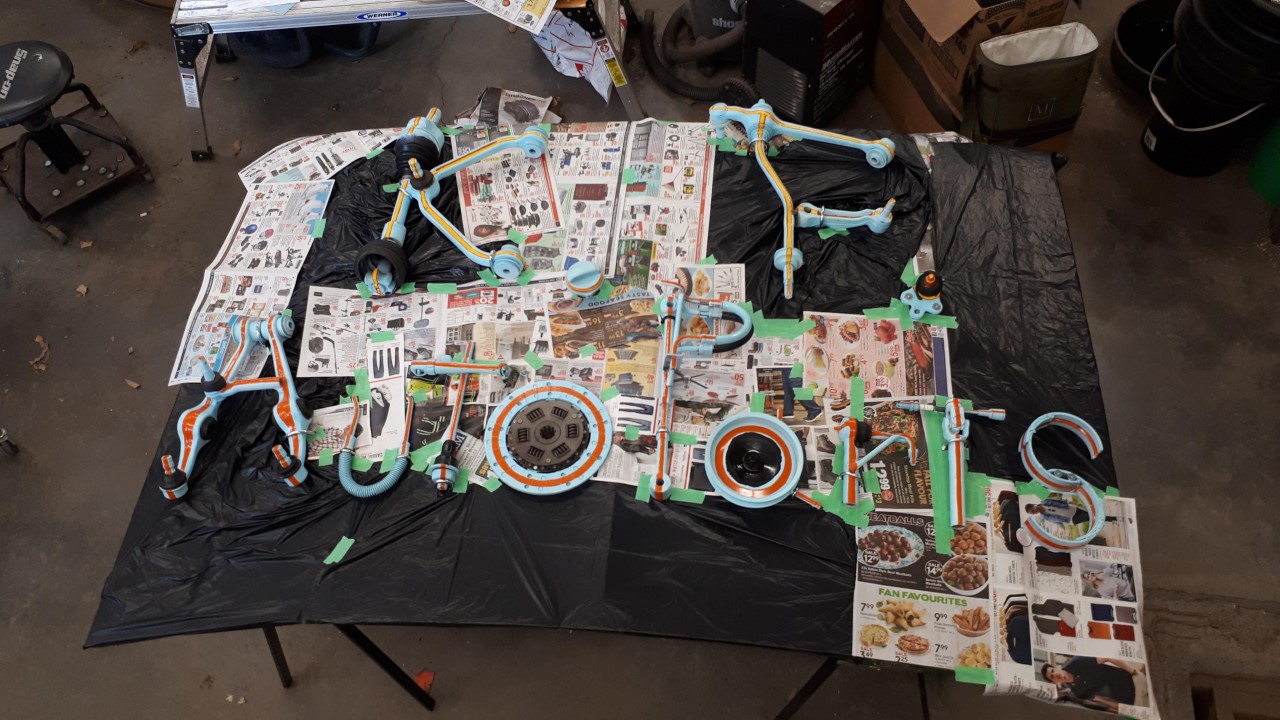
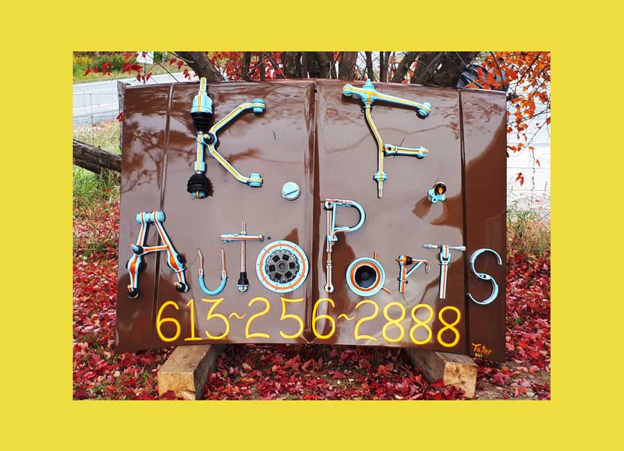
So… one February night while chatting with a fellow motorhead over a coupla wobbly pops…. I threw this wee notion that had been kicking around in Taterland out on the floor for discussion…. K.F seemed to think it was kinda funky too when I later told him of my idea. So – I got busy pickin’ parts fresh from his yard! – Including the canvas! See a bit O’ the magic here below…
(*Special thanks to fellow motorhead “L.C.” for the welding! ~ He knows who he is!)
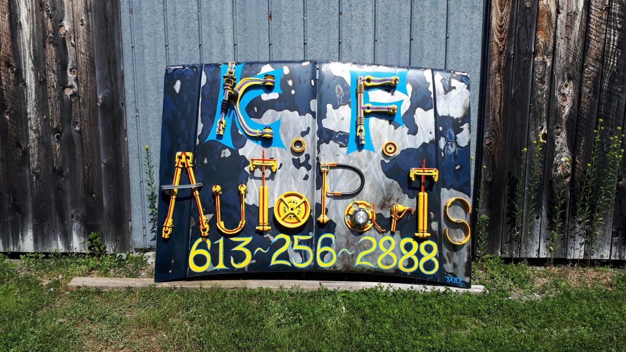
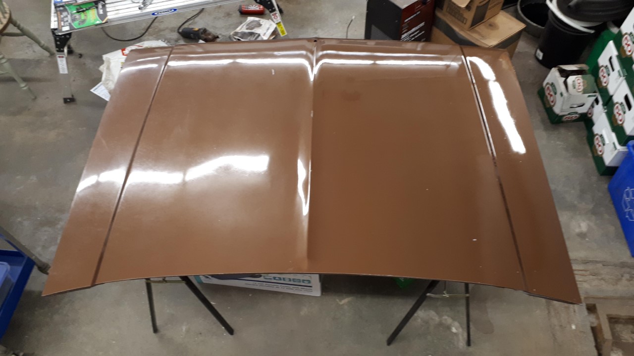
Originally, I was going to strip this hood… but as I started to remove paint with the sander… this glorious rat roddy thing started to appear… so I stopped (a little-ish) then shot clear over it to preserve the look and hold back the rust a bit… just a wee bit tho… hoping it will funkify over time...
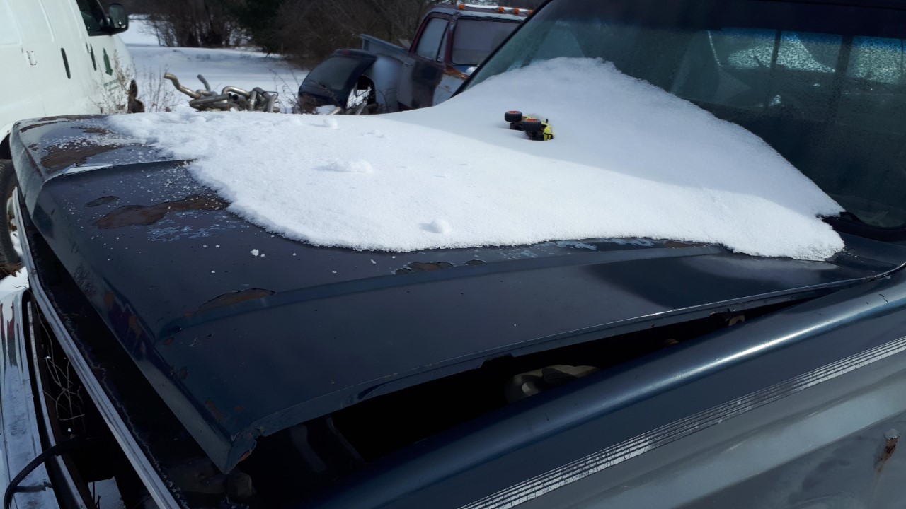
The canvas picked winter fresh from the fields!
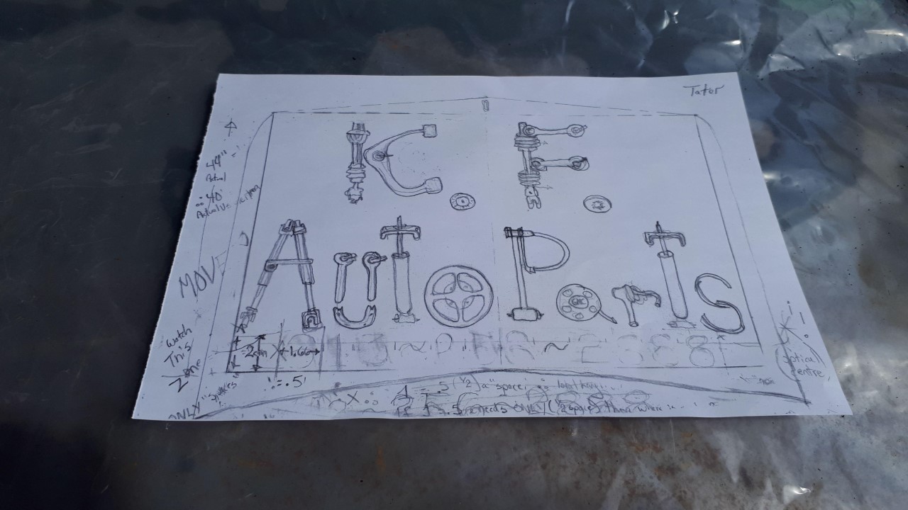
Wanting to create a place to play with colour design.. I created this rendering and turned it into a coupla copies, so I could use my artist markers to scheme...
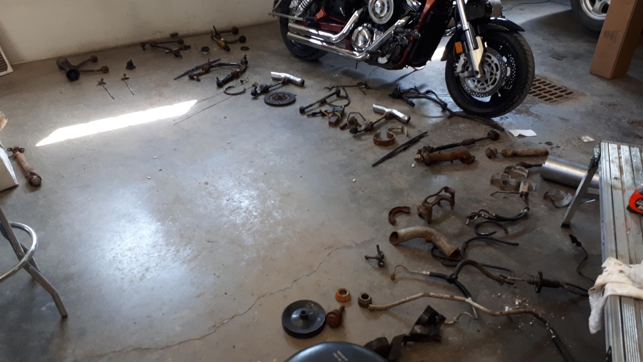
Skull buggery tryin to figure out what parts could create my letters
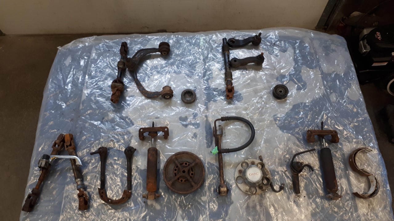
Yip… this group fit across the hood… it’s a go!
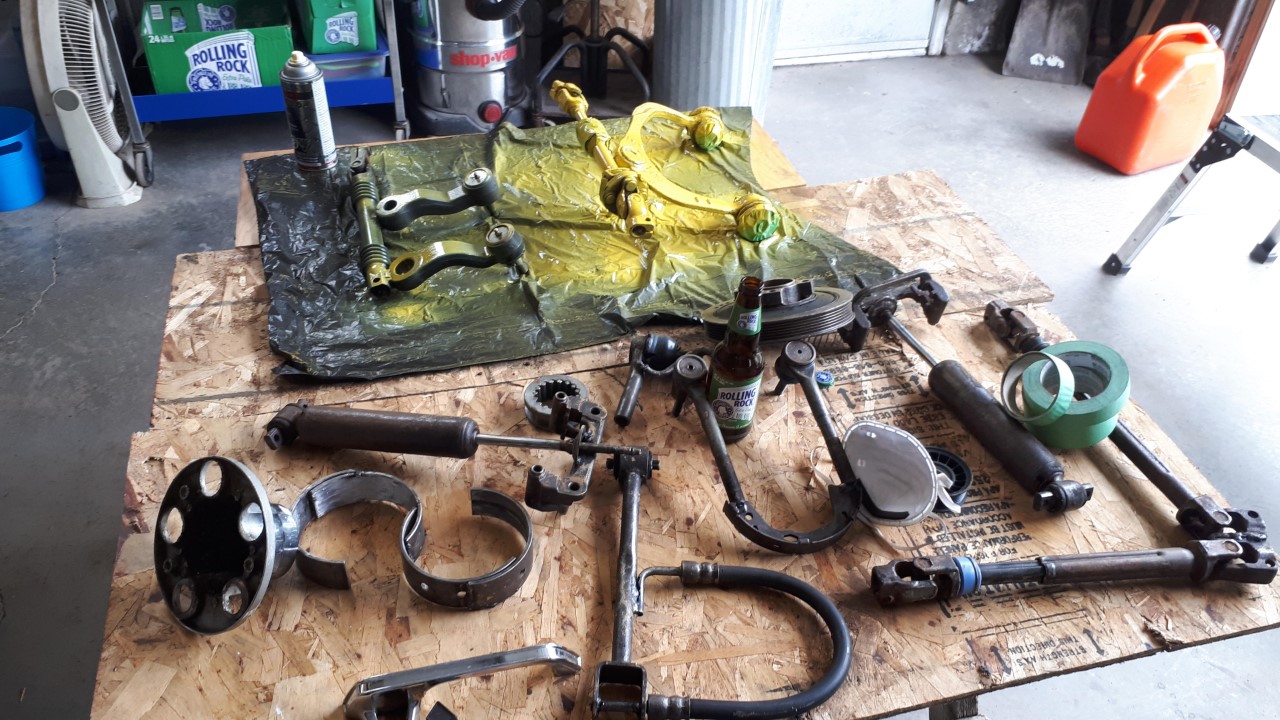
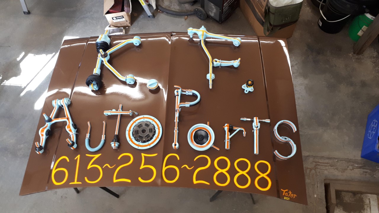
All parts had to be cleaned & sandblasted before being welded together then layin on their canary yellow base.
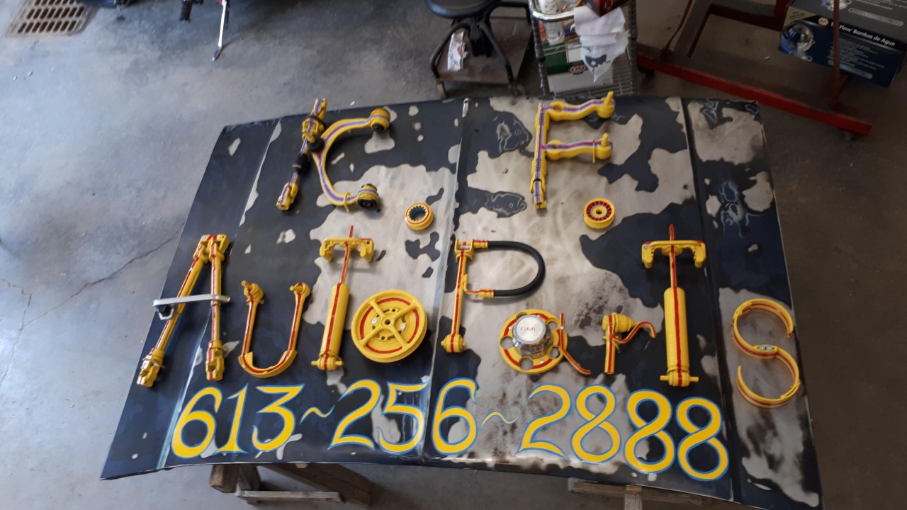
After standing er up outside shop to take a step back to assess while thinkin yay, me done! I realized not quite... the mottled hood we (ME) all loved so much made it hard to see the letters K.F. from a distance.... dirty ratsafrats!!!
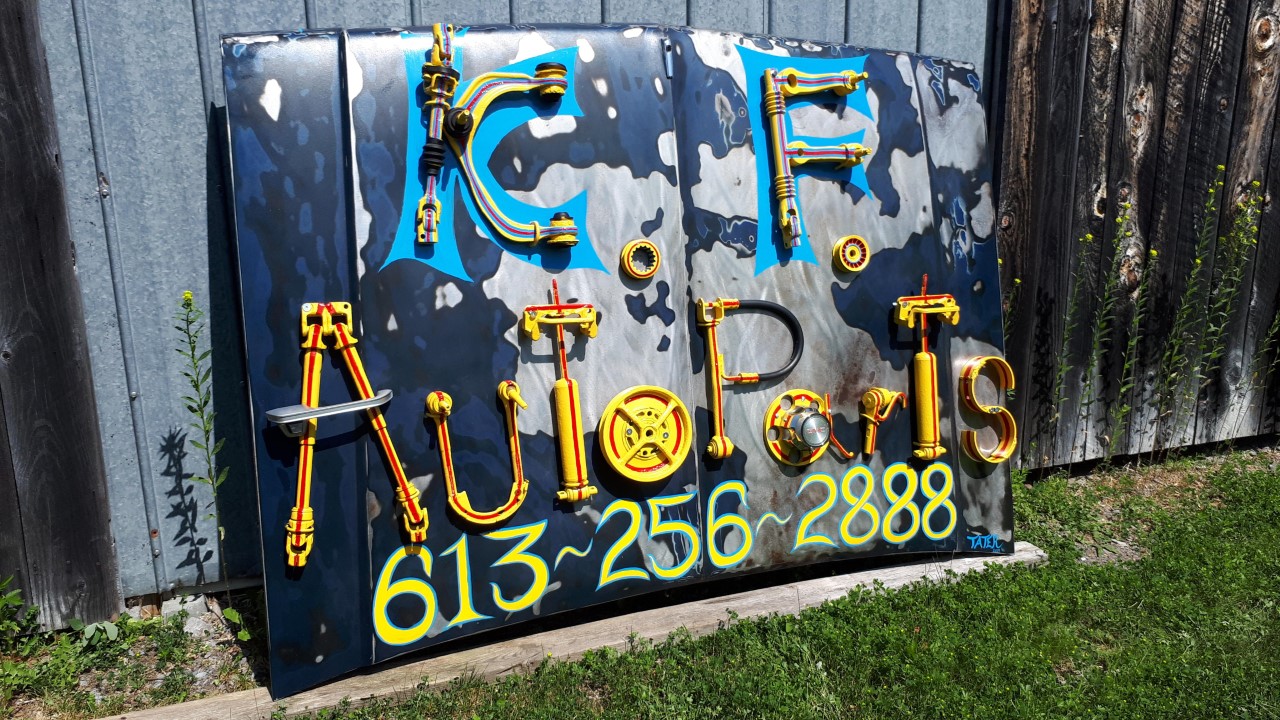
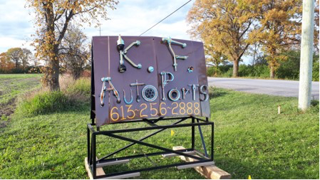
Located on Hwy 29 between Almonte n’ Pakenham peeps!
Upon receiving the first, blue hood, K.F. was pretty taken with what I showed up with months after our first chat. He more or less said he hadn’t been sure back in February how I was gonna manage, but wanted to see what I would come up with!
He was pretty chuffed with what I presented him that day! Several weeks later, while there on a parts hunt for my beloved pick up, he asked if I wouldn’t “mind” doin’ a second one……
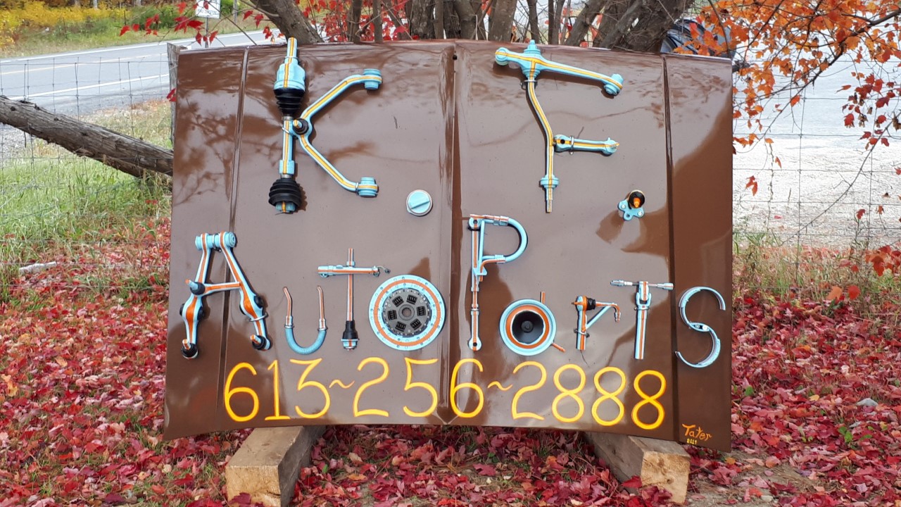 *DETAILER”S DELIGHT! – I got to get my detailin’ groove on and gave this hood a solid buff n’ polish to make it POP from the start!
As with hood #1 picked, sorted, selected, degreased, then sandblasted appropriate parts to create the letters… I wanted to do a few things different here, mainly for variety, but some were fun to use again… Ah…..art!
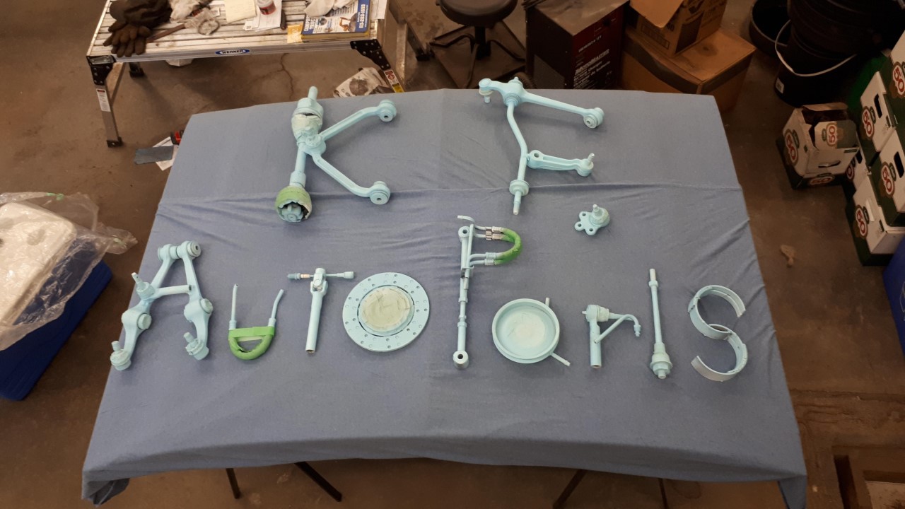
Wanted a retro colour scheme that would still serve with a strong contrast for a road sign… had to go with surf blue n’ a splash of orange inside that yellow to complete the feel….kf